THE IMPORTANCE OF THE PRINT TEMPLATE
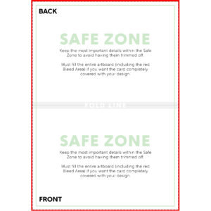
When using the template to create your artwork, pay close attention to the green Safe Zone. The most important aspects of your design should remain within the safe zone to ensure they are printed on the final product. Anything outside of the safe zone runs the risk of getting trimmed off.
The red Bleed Area represents the edge of the print area and then some. The bleed area will likely not show on the final print but if you do not have artwork/color/texture you run the risk of having blank (white) portions that appear on the card print. Bleed areas within print templates are in place as a preventative measure in case of errors that can occur in the printing and cutting process.
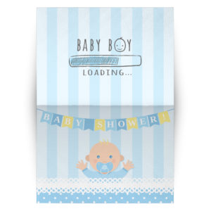
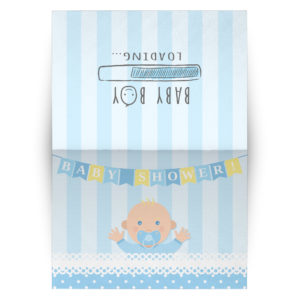
When using the template for the folded cards please make note of where the front and back of the card is located and think about how your artwork will be displayed on the finished product. You may need to adjust your artwork to show correctly to the viewer. The examples below illustrate this point. The artwork on the middle image may appear correct at first glance, but if you had a physical card in your hand, you would have to view the back of the card upside down to read it when the card is not opened. The third image shows the proper way to display artwork on the back of a horizontal card – it may appear that the design on back of the card is upside down, but in actuality, if the card was closed, the artwork would be displayed correctly. This concept may seem a little silly, but it is important to understand so your card does not look like it was printed with a design mistake.
DESIGN TIPS
1.) Upload High Resolution Files: It is highly recommended that you upload art work at 300dpi. 300dpi is the standard resolution for print while 72dpi is reserved for web applications. Unlike other products, the cards have minimal textures to hide imperfections in your artwork. If you upload artwork lower than 300dpi it will likely show pixelation which can cheapen the overall quality of your card. You may not notice the low quality on the mockup images, so it is up to you to use your best judgement before uploading your design.
If all you have to work with is lower resolution images, a good tip is to apply textures or graphic overlays (filters) to hide glaring imperfections. Please see our blog post on image resolution HERE.
2.) Give Your Artwork Room to Breathe: Just because you can cover the entire card with artwork, does not mean it will always look good. A common mistake made by most beginner designers is when they try to cover as much space with their design as possible. This isn’t always a bad thing, but in most cases, it can be the difference between a graphic looking like it was created by an amateur vs a professional. Give the important aspects of your design plenty of room from the edges. This allows your artwork to shine and stand out rather than feel cramped within the confines of the print area. Don’t be afraid of negative (empty) space. Negative space can be utilized to make your graphic appear more clean and polished.


3.) Gold Foil and Metallics: Gold foil and metallic elements in card designs is a popular trend. Unfortunately they will not translate well with the cards we are offering. In order to have the proper effect, inks would need metallic fleck or reflective properties. You can certainly create artwork to mimic this look, but it will not be printed to the standards of a card with real foil or metallics incorporated into the ink. We feel it is important for our users to understand this to keep realistic expectations about outputted artwork.
4.) RGB vs CMYK: Knowing your color codes may be the most important practice when using Print on Demand. RGB (Red, Green & Blue) is the color code for web applications. CMYK (Cyan, Magenta, Yellow & Black) is the color code for print applications.
We ask that our users upload artwork in RGB because they are uploading a graphic to the web. We strongly recommend checking the files in CMYK prior to upload because the graphic uploaded in RGB will be converted to CMYK at the print facility. DO NOT upload artwork to the app in CMYK – this will cause issues with how your design colors are represented on the mockup images. Upload your artwork in RGB, but check your file in CMYK first and adjust accordingly.
Some colors are created specifically for your screen using RGB. We call these backlit colors as they are using light from your computer monitor to add more intense vibrancy that cannot be reproduced in the printing process. This is why we always recommend checking your files in CMYK before uploading because there can be drastic shifts in color that completely change what is shown on your mockup image versus the final product. Please see the example below.