TEELAUNCH STANDARD APPAREL DESIGN & UPLOAD BREAKDOWN
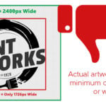
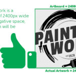
At teelaunch, we require your artwork to be a PNG at a minimum of 2400px wide.
• A PNG for its flexibility to either allow transparency or have a solid background.
• A minimum of 2400px wide to ensure the artwork that is uploaded is high enough quality to meet our print standards. The app automatically trims the surrounding negative (empty) space around your artwork to make sure that the actual visible pixels meet the 2400px wide requirement. If your file is not a minimum of 2400px wide, the app will not accept it. It is good practice to trim your file before uploading to save time and avoid any unexpected errors.
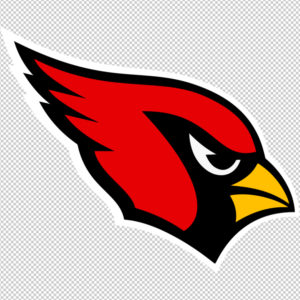
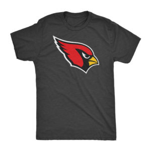
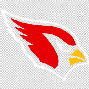
Please click the thumbnails below to see acceptable design specs.
Standard apparel is printed via the DTG (Direct To Garment) process. DTG printing differs from screen printing. Screen printing is a more expensive process with a limited color palette and requires more basic designs. DTG printing is built for one-off prints/short runs and is ideal for more elaborate designs with an extensive color palette. Please read on for important information regarding of how to properly create designs for DTG printing and how to maximize the potential of your graphics.
RGB vs CMYK COLOR CODE
Knowing your color codes may be the most important practice when using Print on Demand. RGB (Red, Green & Blue) is the color code for web applications. CMYK (Cyan, Magenta, Yellow & Black) is the color code for print applications.
We ask that our users upload artwork in RGB because they are uploading a graphic to the web. We strongly recommend checking the files in CMYK prior to upload because the graphic uploaded in RGB will be converted to CMYK at the print facility. DO NOT upload artwork to the app in CMYK – this will cause issues with how your design colors are represented on the mockup images. Upload your artwork in RGB, but check your file in CMYK first and adjust accordingly.
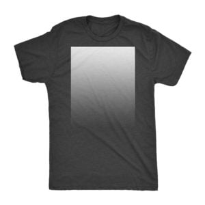
Some colors are created specifically for your screen using RGB. We call these backlit colors as they are using light from your computer monitor to add more intense vibrancy that cannot be reproduced in the DTG printing process. This is why we always recommend checking your files in CMYK before uploading because there can be drastic shifts in color that completely change what is shown on your mockup image versus the final product. Please see the example below.

DESIGN TIPS
We want to meet and even exceed your print expectations, but a proper understanding of what works and does not work is required first. There are certain design techniques and applications that do not lend themselves well to the DTG printing process. We will go over design pitfalls and what to avoid.
1.) Metallics, Glitter & Foils: A popular trend in fashion design is incorporating metallic elements into the garment design. Unfortunately, this does not translate well in DTG printing. In order to achieve a metallic look, there needs to be special ink applied that has reflective properties or a metallic fleck within it. DTG printing has neither of these. If you are to create a design that features this effect, you can expect it to appear more like a photographic representation which will appear much more flat than you may anticipate as there is no special metallics in the ink.
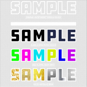
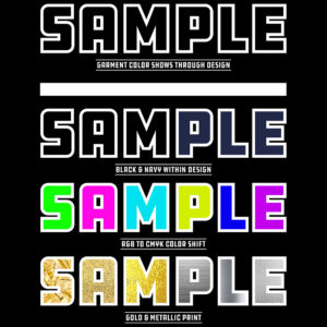
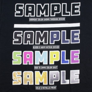
2.) Same or Similar Colors in Comparison to the Garment: It is recommended that you avoid using the same or similar colors in your design as the garment it is getting printed on. During the printing process, there is a white base layer of ink that gets laid down before your actual graphic is printed. This base layer acts as an adhesive as well as gives the other colors within the graphic a solid base to appear as rich and vibrant as possible.
If you would like to maximize the potential of your design, we highly suggest using the garment color to your advantage within your design. If you are creating a design with black colored elements and want it on a black shirt, consider making the black elements within the design transparent so the black of the garment shows through in those areas. This will ensure the black in the design matches the black of the garment whereas if you left the black in the design, it will most likely appear lighter than the garment, thus creating a less impactful design.

3.) Drop Shadows/Glows & Low Opacity Elements: It is highly recommended to avoid using drop shadows and glows when creating designs for standard apparel. This effect is generally a useful technique in adding dimension to your artwork but will not turn out ideally on a garment. As mentioned above, there is a white base layer of ink that is applied to the garment before any other color is applied. This will effect any sort of drop shadow or glow by adding a faint white haze look. A common remedy/fix used to replace shadows or glows is halftones. Halftones use solid color in the form of varying sized dots. This gives the illusion of fading colors or gradients, but has solid ink placed on the garment which prevents the white base layer from showing through. If you insist on using a drop shadow or glow effect, please make sure there is a background behind the effected area. If the effect is applied to a transparent area of the design, it will turn out less than ideal.

Using design elements that have low opacity tend to get lost in the final print. If you have a design element that you want to be seen, it is recommended that you incorporate it into your design at 50% opacity or higher. Always err on the side of brighter or higher opacity to ensure the proper amount of color shows up on the final print.
4.) Higher Quality Garments = Higher Quality Prints: DTG printing reacts differently to different types of fabric blends. Graphics are heated into the garment to create a long lasting print and depending on the caliber of shirt, fibers from the garment may show through which can have an effect on the overall look of the print. The quality of garment is reflected by the price. For example if you decide to use a Gildan brand shirt, the graphic that is printed may not look as sharp or vibrant as a Next Level branded tee. There is a slight difference in price, but the overall quality/look/feel is noticeable.
5.) Be Aware of Size: We have a QuickPosition feature on the upload screen that allows our users to quickly and accurately position their artwork. The feature has pre-determined print locations and sizes available which gives users flexibility to move and resize artwork to their liking. The complexity and size of the elements on your graphic play an important role in which size/placement you should choose. If your graphic is elaborate or text heavy, you should consider avoiding smaller graphic placement such as left/right chest. The smaller your graphic gets printed, the harder it becomes to read. It is good practice in apparel design to create artwork that is easily digestible to the viewer. If design elements are hard to read on your computer monitor at 100% view, it is a high possibility that it will not translate over to a max size print on a garment. The print can only be as good as the file submitted.
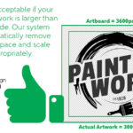
6.) Use A Design Template: We typically offer print templates for all of our products, but standard apparel is different. Designing for standard apparel is so wide open that we cannot limit our users to one specific template, but we can offer some advice on standardizing the process. The MINIMUM size of artwork we accept is a trimmed (no surrounding empty space) graphic that is 2400px wide. You can upload artwork larger than that, though. Our printers have a maximum print area of 12”x 15” and print artwork @200dpi (2400px by 3000px). This means that the minimum artwork that can be accepted will meet the requirements for a maximum sized print.
It is good practice to design artwork that is to be printed, at 300dpi. This is the standard resolution for print (72dpi for web). Although our printers will downsize the artwork to meet their 200dpi requirement, creating art @300dpi makes your design file much more versatile for other applications and products. We have found that creating an art board at 12”x 15” @300dpi (3600px by 4500px) works very well in standard apparel design. You will still need to make sure the file is a minimum of 2400px wide before upload though. To test the 2400px requirement in Photoshop, make sure the background layer is off and showing transparency behind your design – then go to Image<Trim and select transparent pixels. This will trim away any areas surrounding your graphic that does not have any pixels showing. If your file is above 2400px wide, you are all set to upload!
If the maximum print width is 12 inches and the maximum print height is 15 inches. This means artwork that extends further than 15” in height will shrink the max width of the design to fit the height of the design into the print area accordingly. This is important to understand as the QuickPosition feature allows for lower placements from the collar of the garment. For example, if you upload a graphic that fils the entire print area of 12”x15”, but want the placement lower, the graphic print size will actually shrink the lower you go down from the collar to compensate for the maximum print area.
QUESTIONS OR CONCERNS?
If you still find yourself having questions or concerns, please contact our customer support team at [email protected]. We will be more than happy to assist you.