Creating the framework for a personalized mug is quite different from creating a design for the normal standard mugs we offer. It is important that your read through the Best Practices so you have the proper understanding of how to create a mug overlay that works with the teelaunch personalization feature. We will discuss how the personalization feature works, how to utilize/follow the print templates supplied in the app, and offer useful techniques and examples to assist with the design process.
THE PERSONALIZATION FEATURE
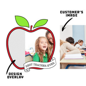
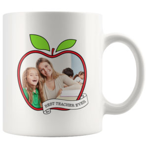
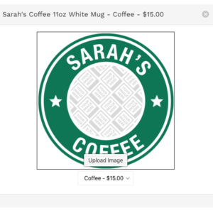
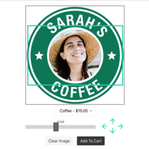
The Personalization Feature allows your customers to have a hand in the design process by giving them the ability to upload their own image to the product. We like to use the example of a picture frame to illustrate how the feature works. You will be creating the picture frame and the customer will have the ability to upload their own image that slides behind the frame. The customer will have the ability to scale and move their image to fit the frame however they see fit. Once they are happy with their image placement, they will place their order wherein teelaunch will create a print file with your artwork and the customer’s image composited together.
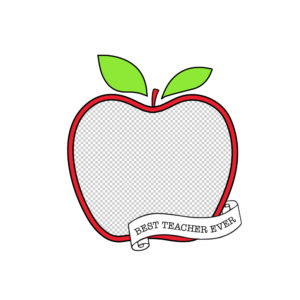
You MUST create artwork that has a portion of transparency for the personalization feature to work properly. The transparent portion of your design is the area where your customer’s image will be placed and show through behind the design you have created. If you do not have transparency within your design that you upload, the design will print without the personalized image from your customer.

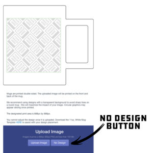
The mugs are one of the personalized products that we are also offering the option to leave the design area completely blank. Publishing a mug with no design will allow your customers to take advantage of the entire print area of the mug for their own image. We suggest offering a mug with this option in your store for two reasons – It takes no time or effort to create the product as well as it gives your customer complete control of the design on the final product. If you would like to utilize this product option, simply click the “No Design” button located next to the standard “Upload Image” button. This will take you directly to the publish screen with no additional artwork displayed on the mockup image (only the “Your Image Here” pattern). When your customer personalizes the product, the entire print area will be open for them to place their image.
Your average consumer does not have the access to design software, nor do they know how to properly use it. We created the personalization feature with this in mind. Since most people use their cellphones to take and save their images, we have made a mobile friendly version of the feature that is intuitive and easy to use for even the most basic of smartphone users. They will have the ability to touch and drag their images as well as use the slider bar and directional arrow tools to properly place their image.
THE IMPORTANCE OF THE PRINT TEMPLATE
The template for the mug is set up to display the entire print area. When artwork is uploaded into the app; it is not scalable – this is why it is important to use the print template to help determine the size and placement of your artwork.
PERSONALIZED MUG DESIGN TIPS
The design tips in this Best Practices are specific toward creating graphic overlays for personalized mugs. If you would like more general design tips & tricks for mugs, please see those Best Practices HERE.
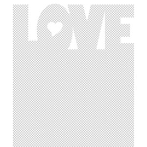
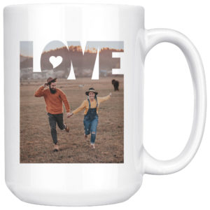
1.) Use Design Elements to Your Advantage: Creating graphic overlays with simple shapes to frame your customer’s images is always a great option, but if you are wanting to take your designs to the next level, consider using design elements that interact with the images your customer’s upload. A great example of this is using text that extends through the transparent areas of your design and would even cover a portion of your customer’s image.
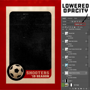
3.) Blending Modes & Opacity Changes: Using blending modes helps enhance designs by adding dimension and character to a design and in some cases add a more realistic appearance to a piece. Changes in opacity of colors and design elements can give your artwork a much more dynamic look and feel. Be creative and play around with these techniques to increase the quality of your artwork.
Be aware that any sort of blending modes you choose to use DO NOT affect the transparent portion of your design. Although it will work within your design software, it will not apply the blending mode on the finished PNG. If you would like to add special effects such as texture or gradients to the transparent space of your design, it is highly recommended that you stick to opacity changes. We have an example of an overlay that looks like a sports card below. To give the effect of vintage dots and texture over the customer’s image, we added a white halftone texture in the transparent space reserved for our customer’s image. We then lowered the opacity to 35% so it would allow the image to show through, but also gives the effect of texture. Creating a design that utilizes this technique will ONLY work if you strictly use changes in opacity. If you try to achieve this look with blending modes, it will not turn out as expected because the blending mode will not take affect after the file is saved and uploaded into the app. Blending modes will only work inside of your design software and are meant to be saved for the end result of a design (i.e. finished design with no transparency included).


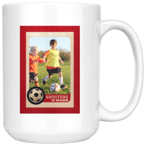
3.) Design With a Purpose: Obviously creating artwork that appeals to the masses will give you an opportunity to sell to more people, but creating artwork that is designed for a specific demographic will help you fine-tune your marketing strategy. Not only will you be able to trim down advertising costs by having higher conversion rates, you will also be able to test out your overlay designs to better suit the type of personalized image your customer will most likely upload. Take, for example, the sports card design overlay we referenced above… Since this particular design is aimed at featuring an athlete either in action or posing for a portrait, it makes more sense to create an overlay that has a large and unobstructed opening for your customers to place their image. If you were to have an overlay that is busy with a transparent opening that is uncommonly shaped, it may be difficult for your customer’s to properly place and size their image to be displayed ideally. When you create your designs with a purpose, you can test out potential image scenarios to make sure you are giving your customers the best opportunity to personalize their canvas with a high success rate.
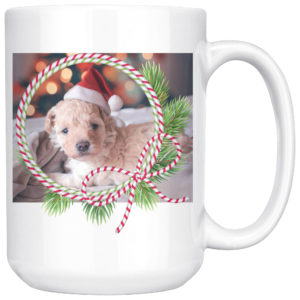
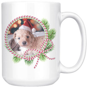
4.) Filling In Unused Transparent Space with White: It is important to make sure that any transparent space in the design area that you do not want your customer’s image spilling into is filled with white (color of mug). If your personalized mug has transparent space within the print area of the mug, your customer’s image has the potential to show even if you did not design for it. Below is an example that better illustrates this concept.
Transparency Outside of Overlay (BAD):

Outside Transparency Filled with White (GOOD):


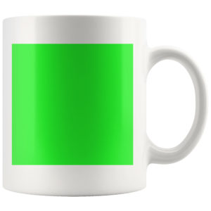
5.) RGB vs CMYK: Knowing your color codes may be the most important practice when using Print on Demand. RGB (Red, Green & Blue) is the color code for web applications. CMYK (Cyan, Magenta, Yellow & Black) is the color code for print applications.
We ask that our users upload artwork in RGB because they are uploading a graphic to the web. We strongly recommend checking the files in CMYK prior to upload because the graphic uploaded in RGB will be converted to CMYK at the print facility. DO NOT upload artwork to the app in CMYK – this will cause issues with how your design colors are represented on the mockup images. Upload your artwork in RGB, but check your file in CMYK first and adjust accordingly.
Some colors are created specifically for your screen using RGB. We call these backlit colors as they are using light from your computer monitor to add more intense vibrancy that cannot be reproduced in the printing process. This is why we always recommend checking your files in CMYK before uploading because there can be drastic shifts in color that completely change what is shown on your mockup image versus the final product. Please see the example below.