Creating the framework for a personalized canvas is quite different from creating a design for the normal standard canvases that we offer. It is important that you read through the Best Practices so you have the proper understanding of how to create a canvas overlay that works with the teelaunch personalization feature. We will discuss how the personalization feature works, how to utilize/follow the print templates supplied in the app, and offer useful techniques and examples to assist with the design process.
THE PERSONALIZATION FEATURE
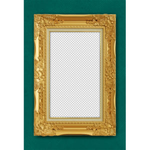
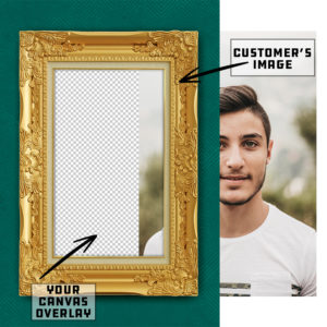
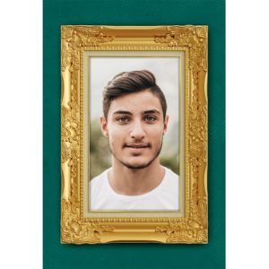
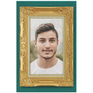
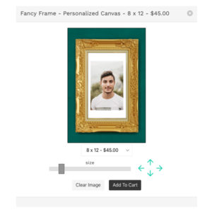
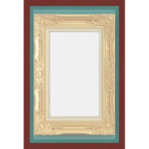
The Personalization Feature allows your customers to have a hand in the design process by giving them the ability upload their own image to the product. We like to use the example of a picture frame to illustrate how the feature works. You will be creating the picture frame and the customer will have the ability to upload their own image that slides behind the frame. The customer will have the ability to scale and move their image to fit the frame however they see fit. Once they are happy with their image placement, they will place their order wherein teelaunch will create a print file with your artwork and the customer’s image composited together.
Your average consumer does not have the access to design software, nor do they likely know how to properly use it. We created the personalization feature with this in mind. Since most people use their cellphones to take and save their images, we have made a mobile friendly version of the feature that is intuitive and easy to use for even the most basic of smartphone users. They will have the ability to touch and drag their images as well as use the slider bar and directional arrow tools to properly place their image.
USING THE PRINT TEMPLATES
It is extremely important that you follow the print templates provided in the app when creating artwork for the personalized canvases. You are giving your customers the ability to customize the final product which means it is up to you to create the proper boundaries to ensure the canvas they receive is satisfactory.
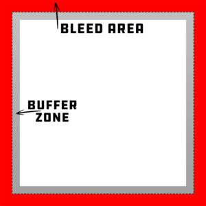
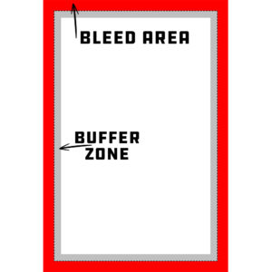
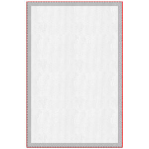
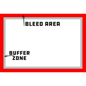
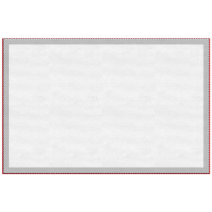
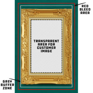
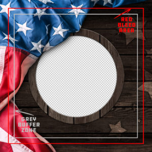
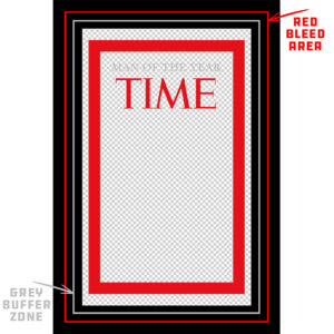
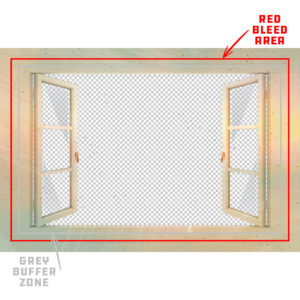
Unlike our other print templates, there is no marked safe zone. The reason for this is because we do not want the template to influence the creative potential of your design framework. We do, however, have a bleed area and buffer zone to help guide you through the design process so important aspects of your design will appear on the front of the canvas if followed correctly.
The red Bleed Area represents the edges of the canvas as well as the sides that wrap around to the back of the canvas frame. Although the bleed area does not represent the front of the canvas, it is important to extend/continue your artwork through the bleed area to ensure no unwanted blank (white) areas appear on the final print. Having artwork on the sides of the canvas is part of the appeal of a gallery style canvas wrap so we recommend applying some sort of continuation of background artwork in the bleed area.
The grey Buffer Zone is an extension of the bleed area. Since there is technically no safe zone, we ask that you keep the most important design elements (text, logos, characters, etc.) inside of the buffer zone to avoid having them wrap around the sides of the canvas frame. This also includes any transparent aspects of the design where your customer’s personalized image will be placed. If you do not properly design for the buffer zone, you run the risk of not having important details on the front of the canvas – especially the image your customer uploads. Your customer will not be happy if a portion of a face does not appear on the front of a canvas. Essentially, the buffer zone gives your artwork room to breathe from the edge of the canvas.
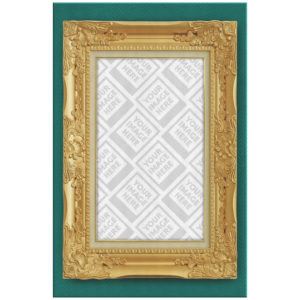
You MUST create artwork that has a portion of transparency for the personalization feature to work properly. The transparent portion of your design is the area where your customer’s image will be placed and show through behind the design you have created. If you do not have transparency within your design that you upload, the canvas will print without the personalized image from your customer. It is also important to make sure that any transparent portions of your design remain inside of the buffer zone. If you do not keep the transparency inside of the buffer zone we cannot guarantee that your customer’s image will remain on the front of the canvas.
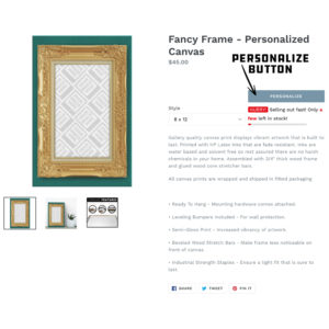
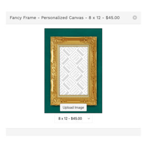
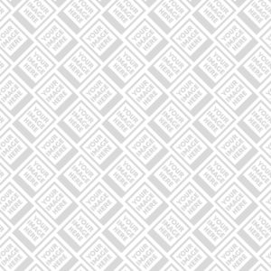
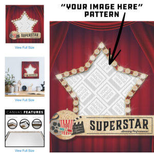
On the design uploader screen within the app, a background pattern of polaroids saying “Your Image Here” will show through where you have transparent space reserved in your design. This pattern will help you visualize where your customers will need to place their images. If you do not see this pattern once you have uploaded your artwork, there is a good chance that you did not create any transparent space in the file you uploaded. The pattern will also display on your final mockup images to illustrate to your customers that this product is able to be personalized by them. If you publish a design to your store that does not display this pattern in the mockup, your customer’s personalized image will not appear on the finished product.
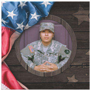
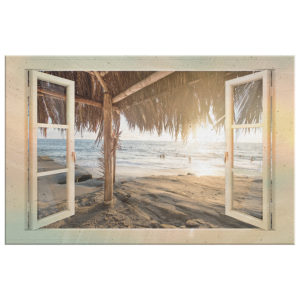
Save your final artwork as a transparent PNG. As previously stated, if you do not have transparency within your design or save as a transparent PNG, your customer’s will not be able to personalize the canvas with their uploaded image. Remove any background layers that obstruct the transparent space you have framed for your customers before saving. Please see the examples below that illustrate proper canvas overlay designs.

DESIGN TIPS
The canvas overlay design possibilities are endless. We will go through some tips and tricks to maximize the full potential of your designs as well as provide some examples to help inspire your creative process.
1.) Use High Resolution Imagery: It is good practice to use hi-res imagery and design elements when creating all of your artwork, but even more so for canvas prints. Your artwork will be printed on a canvas material that has some slight texture, but for the most part there is nowhere to hide lower resolution graphics that appear pixelated. If your artwork appears pixelated at 100% view inside the print template, there is a good chance it will be noticeable on the final product. Please see our blog post on image resolution HERE
A tip for masking imperfections in lower quality artwork is applying textures and using filters. Textures can help take the focus off of pixelated elements by giving the eye another element to fixate on. Using filters is another great technique to use to help blend light and gradient effects with your artwork to help camouflage lower resolution design elements.
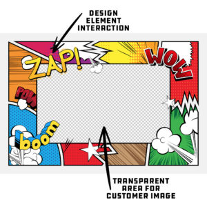
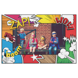
2.) Use Design Elements to Your Advantage: Creating canvas overlays with simple shapes to frame your customer’s images is always a great option, but if you are wanting to take your designs to the next level, consider using design elements that interact with the images your customer’s upload. A great example of this is using text that extends through the transparent areas of your design and would even cover a portion of your customer’s image.
3.) Blending Modes & Opacity Changes: Using blending modes helps enhance designs by adding dimension and character to a design and in some cases add a more realistic appearance to a piece. Changes in opacity of colors and design elements can give your artwork a much more dynamic look and feel. Be creative and play around with these techniques to increase the quality of your artwork.
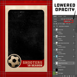
Be aware that any sort of blending modes you choose to use DO NOT affect the transparent portion of your design. Although it will work within your design software, it will not apply the blending mode on the finished PNG. If you would like to add special effects such as texture or gradients to the transparent space of your design, it is highly recommended that you stick to opacity changes. We have an example of a canvas overlay that looks like a sports card below. To give the effect of vintage dots and texture over the customer’s image, we added a white halftone texture in the transparent space reserved for our customer’s image. We then lowered the opacity to 35% so it would allow the image to show through, but also gives the effect of texture. Creating a design that utilizes this technique will ONLY work if you strictly use changes in opacity. If you try to achieve this look with blending modes, it will not turn out as expected because the blending mode will not take affect after the file is saved and uploaded into the app. Blending modes will only work inside of your design software and are meant to be saved for the end result of a design (i.e. finished design with no transparency included).


4.) Design With a Purpose: Obviously creating artwork that appeals to the masses will give you an opportunity to sell to more people, but creating artwork that is designed for a specific demographic will help you fine-tune your marketing strategy. Not only will you be able to trim down advertising costs by having higher conversion rates, you will also be able to test out your canvas overlay designs to better suit the type of personalized image your customer will most likely upload. Take, for example, the sports card canvas overlay we referenced above… Since this particular design is aimed at featuring an athlete either in action or posing for a portrait, it makes more sense to create a canvas overlay that has a large and unobstructed opening for your customers to place their image. If you were to have an overlay that is busy with a transparent opening that is uncommonly shaped, it may be difficult for your customer’s to properly place and size their image to be displayed ideally. When you create your designs with a purpose, you can test out potential image scenarios to make sure you are giving your customers the best opportunity to personalize their canvas with a high success rate.
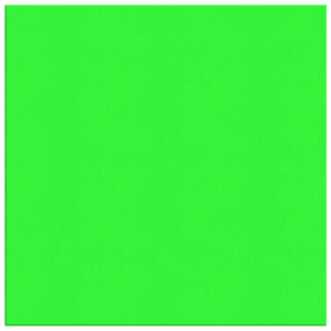
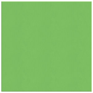
5.) RGB vs CMYK: Knowing your color codes may be the most important practice when using Print on Demand. RGB (Red, Green & Blue) is the color code for web applications. CMYK (Cyan, Magenta, Yellow & Black) is the color code for print applications.
We ask that our users upload artwork in RGB because they are uploading a graphic to the web. We strongly recommend checking the files in CMYK prior to upload because the graphic uploaded in RGB will be converted to CMYK at the print facility. DO NOT upload artwork to the app in CMYK – this will cause issues with how your design colors are represented on the mockup images. Upload your artwork in RGB, but check your file in CMYK first and adjust accordingly.
Some colors are created specifically for your screen using RGB. We call these backlit colors as they are using light from your computer monitor to add more intense vibrancy that cannot be reproduced in the printing process. This is why we always recommend checking your files in CMYK before uploading because there can be drastic shifts in color that completely change what is shown on your mockup image versus the final product. Please see the example below.