THE IMPORTANCE OF THE PRINT TEMPLATE
The Oaklander backpacks are cut & sew products that are assembled AFTER the printing process. Because of this, it is important to understand/use the print templates provided within the app to ensure the final product is created to your expectations. If you do not follow the template correctly, we cannot guarantee certain aspects of your design will show up on the final product.
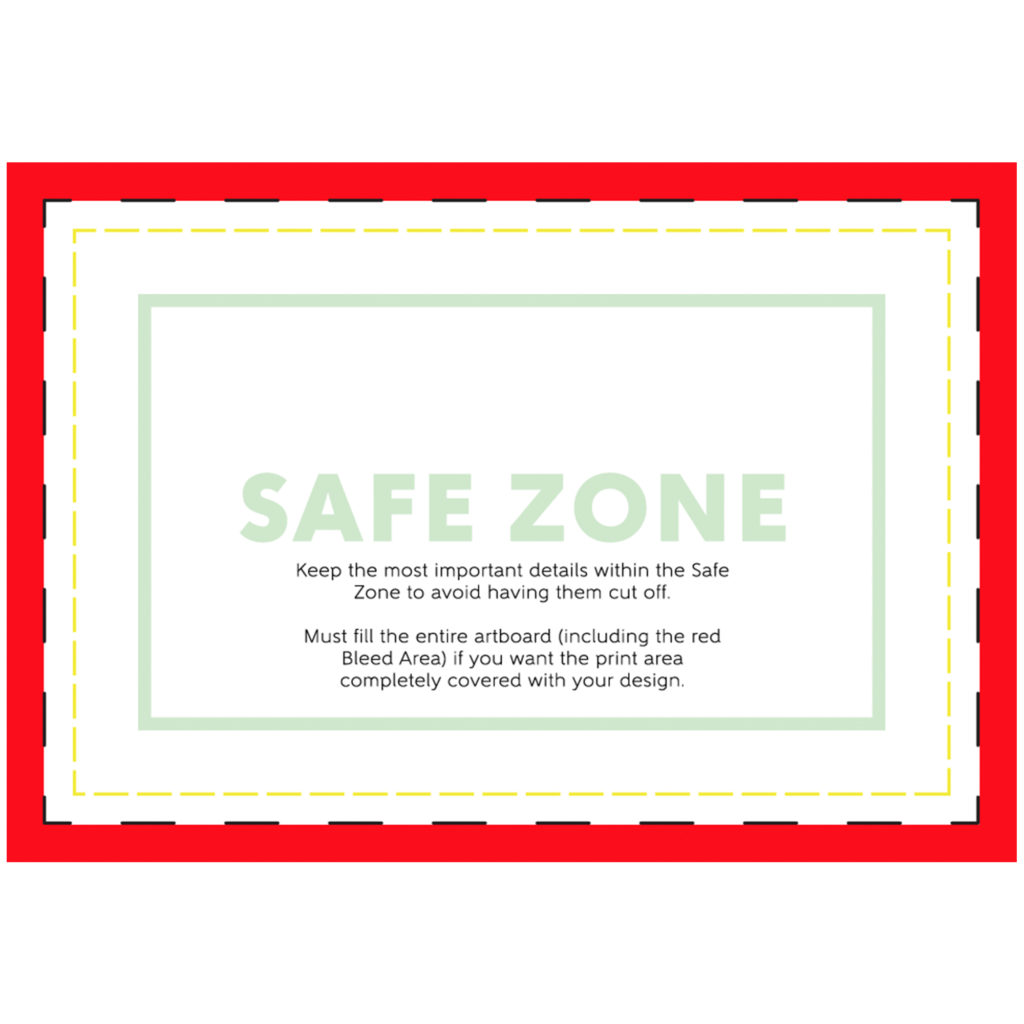
When using the template to create your artwork, pay close attention to the Safe Zone. The safe zone is denoted by the green box. The most important aspects of your design should remain within the safe zone to ensure they are printed on the final product. Anything outside of the safe zone runs the risk of getting trimmed off.
The red Bleed Area represents the edge of the product and then some. It is important to extend your artwork all the way through the bleed area. The bleed area will likely not show on the final product but if you do not have any artwork/color/texture you run the risk of having blank (white) portions that appear on the print areas. Bleed areas within print templates are in place as a preventative measure in case of errors that can occur in the printing and cutting process.
Patch Template 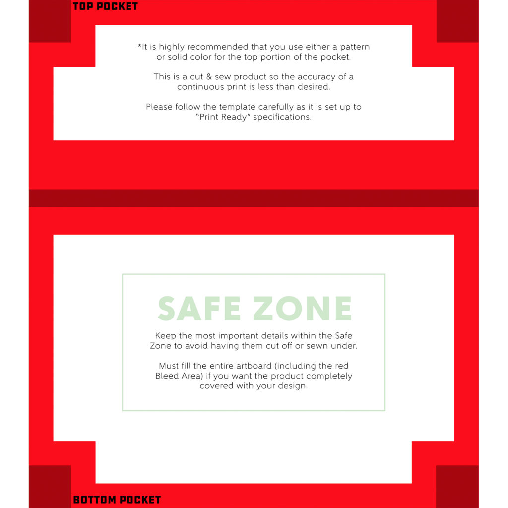
Front Pocket Template 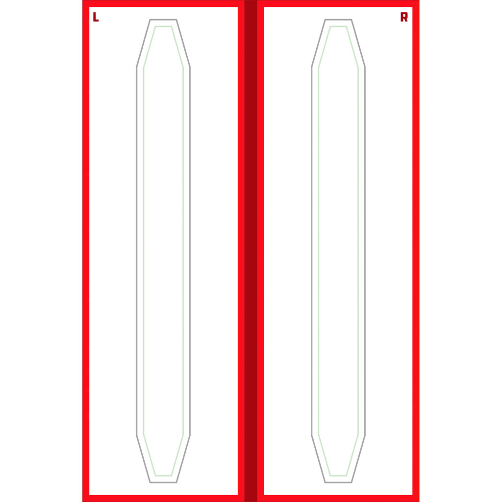
Shoulder Straps Template 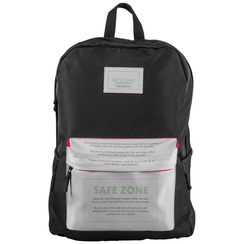
Patch & Pocket Template on Mockup 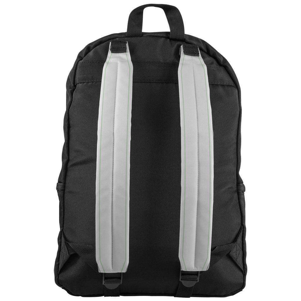
Shoulder Straps Template on Mockup
There are three template files for the Oaklander Backpack (Leather Patch, Front Pocket, and Shoulder Straps). You will need to upload three separate design files to the correct specifications for the product to be accepted by the teelaunch app. The templates are pretty straight forward, but we would like to elaborate on them a little to help you maximize your design files.
Leather Patch – The leather patch is the smallest print area on the Oaklander. The physical size of the patch is 3”x2” which is not very big in comparison to the other print areas on the backpack. It is important to keep the size in mind when you are designing for the patch because text and other finer details can become lost on the print if not accounted for. We strongly recommend keeping designs for the patch simple and bold to avoid any loss in important details.
Shoulder Straps – The template for the shoulder straps is set up as one design file for the left and right strap. The straps are displayed as left facing and right facing which means when the backpack is on a person (wearer), the left strap would be on the right shoulder of the wearer and vice versa. Please see graphic below that better illustrates this concept.
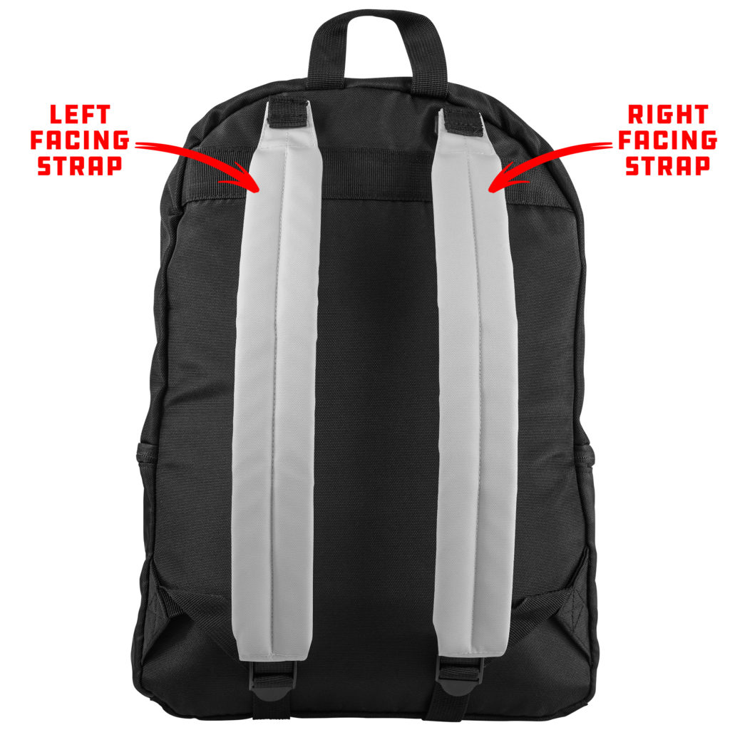
Left & Right Facing Straps
The shoulder straps are also printed flat, then folded around a sturdy/comfortable foam backing and sewn together. What this means in terms of designing is that the safe zone will be displayed on the front of the strap while the remaining design area outside of the safe zone (white area on template) will be wrapped around to the back of the strap.
Front Pocket – The print template for the front pocket is one design file, but is essentially two separate templates in one. The pocket is comprised of two pieces (the top that folds over the zipper and the larger bottom pouch). When designing for the front pocket, we recommend either using a pattern or solid color for the top portion. This is because the template has more bleed area built into it than most of our other products. If you were hoping to have a continuous image/graphic that extended from the bottom pouch to the top flap, we cannot guarantee that there will be a seamless transition from top to bottom. With this being a cut & sew product human error comes into play and it is just a safer bet to try to avoid designs that would require a seamless transition altogether. That being said, we do our best to make the mockup images as accurate as possible, but they are not an absolute representation of the final product. Use the print templates as your guide rather than basing your design placement off of the mockup as the template is made to the exact specifications required by the manufacturer.
SUBLIMATION PROCESS
The backpack is printed through the sublimation process. During the sublimation process, inks are heated to a gaseous state which enables the print to sink into the product pores. When the temperature drops, the ink returns to a solid state and becomes a part of the product. This process allows for longer lasting and more durable prints.
DESIGN TIPS
Knowing the print process helps with creating your designs. Typically sublimation reproduces prints quite accurate to the file you submit to our app. However, there are a few things to keep in mind to ensure your design prints to your satisfaction.
1.) Drop-Shadows: Drop-Shadows help add depth and dimension to designs, but they do not always play nice in the sublimation process. Often times drop-shadows tend to bleed into other aspects of the artwork making the final product look less than ideal in comparison to the uploaded design file. One way to combat this is by using halftones. Halftones are varying sizes of solid color dots that give the illusion of gradients while applying solid color rather than fading from dark to light opacity like you would find in a drop-shadow.
2.) Low Opacity Elements & Blending Modes: Using varying opacities and blending modes helps designs appear more dynamic and, in some cases, more realistic. The sublimation process can blend these effects further than your liking. We suggest erring on the side of higher opacity and blending items to be brighter than what you would prefer on your computer screen. For example, if you like the way your graphic looks at 15% opacity, we would suggest increasing the opacity to 25%-35% so it is not lost on the final print.
3.) RGB vs CMYK: Knowing your color codes may be the most important practice when using Print on Demand. RGB (Red, Green & Blue) is the color code for web applications. CMYK (Cyan, Magenta, Yellow & Black) is the color code for print applications.
We ask that our users upload artwork in RGB because they are uploading a graphic to the web. We strongly recommend checking the files in CMYK prior to upload because the graphic uploaded in RGB will be converted to CMYK at the print facility. DO NOT upload artwork to the app in CMYK – this will cause issues with how your design colors are represented on the mockup images. Upload your artwork in RGB, but check your file in CMYK first and adjust accordingly.
Some colors are created specifically for your screen using RGB. We call these backlit colors as they are using light from your computer monitor to add more intense vibrancy that cannot be reproduced in the printing process. This is why we always recommend checking your files in CMYK before uploading because there can be drastic shifts in color that completely change what is shown on your mockup image versus the final product. Please see the example below.
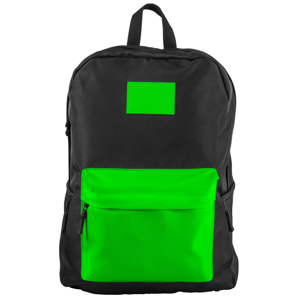
RGB – Backlit Color 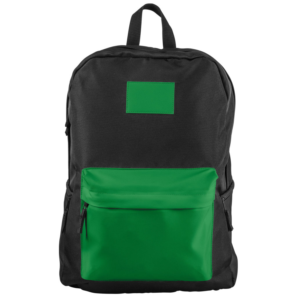
CMYK – How Green Will Reproduce in Print