THE IMPORTANCE OF THE PRINT TEMPLATE
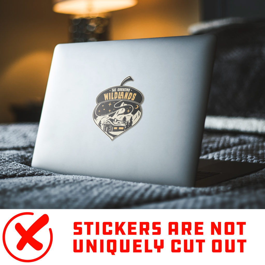
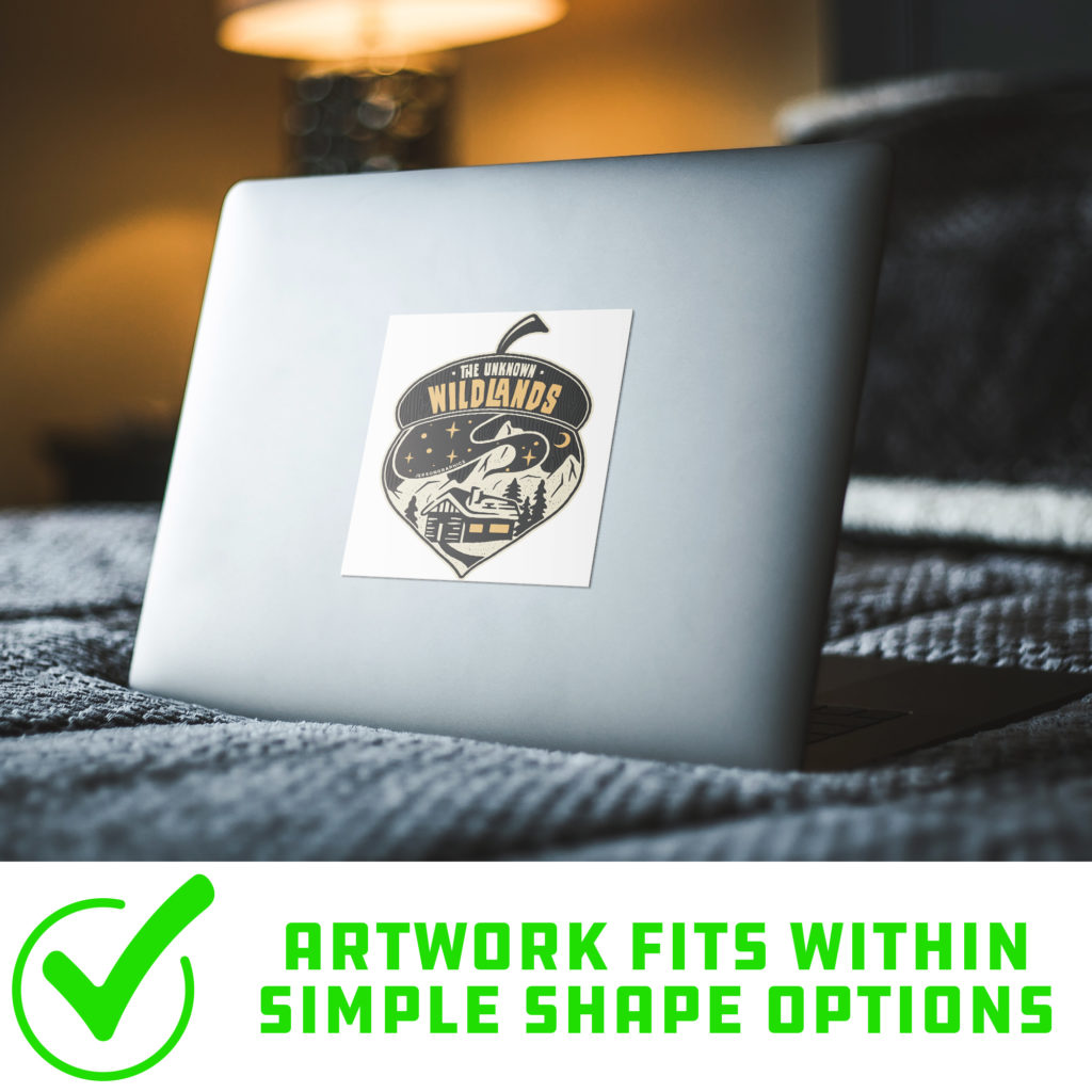
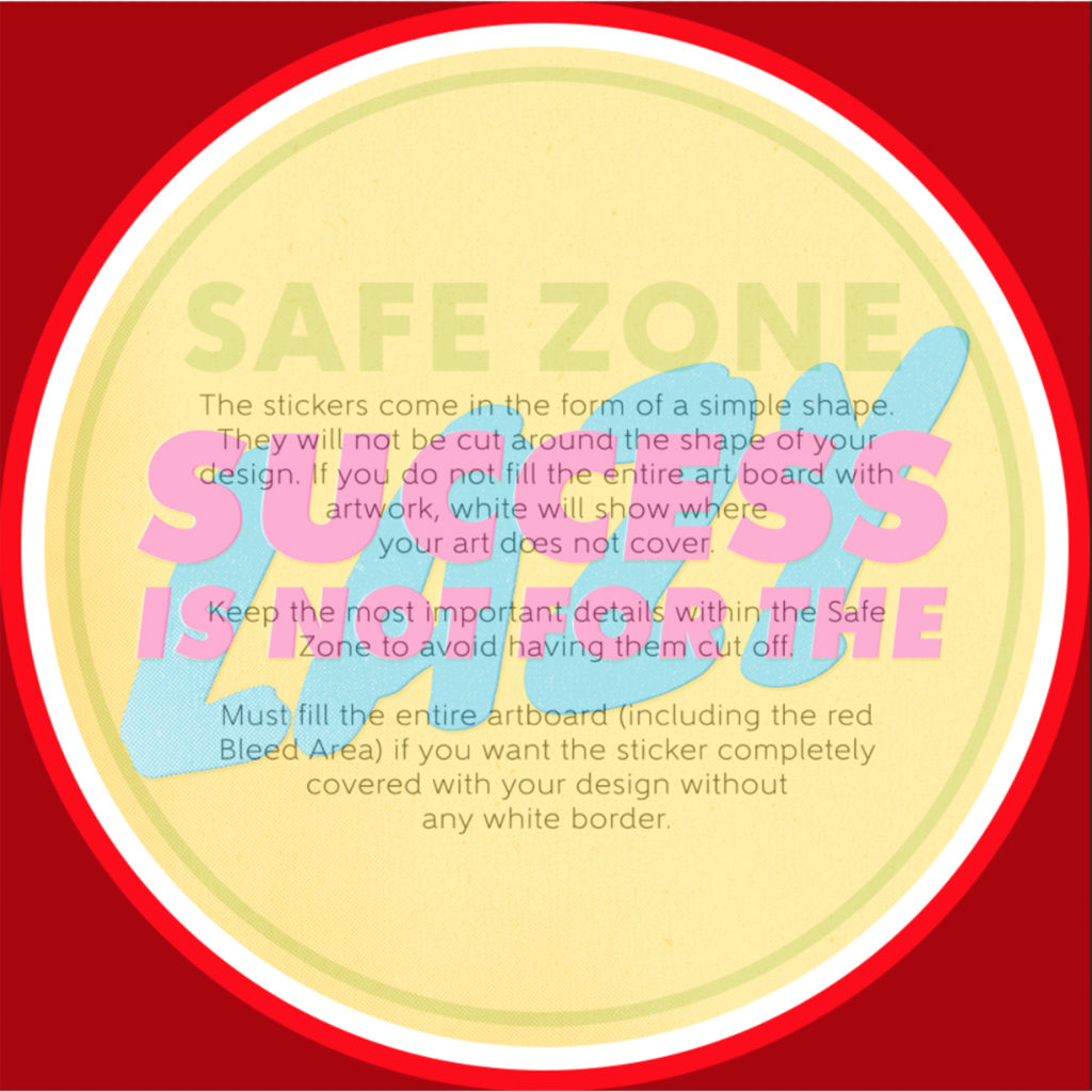
The stickers are offered in the form of simple shapes ( Square, Rectangle, & Circle). This means your artwork will be displayed within the confines of the shape you choose rather than be cut out in the unique shape of your design. This is important to understand as the size and placement of your artwork within the templates will dictate the final outcome of your sticker.
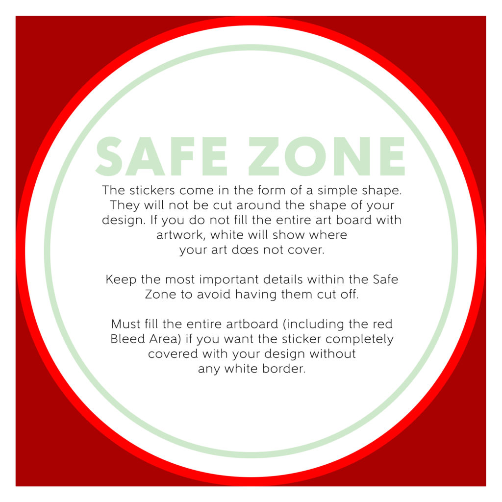
The templates for the stickers are set up to display the entire print area and 1/8” of bleed. When artwork is uploaded into the app; it is not scalable – this is why it is important to use the print template to help determine the size and placement of your artwork.
Circle Sticker Template 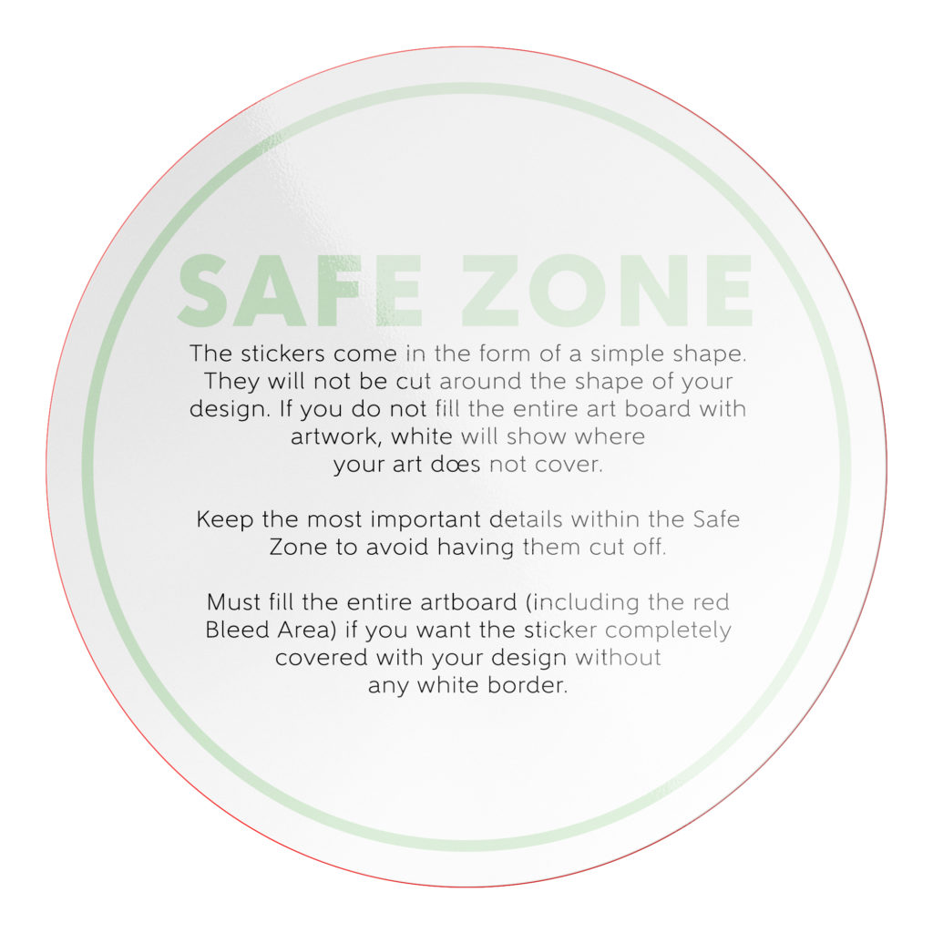
Template on Mockup
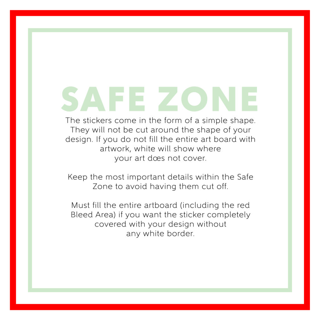
Square Sticker Template 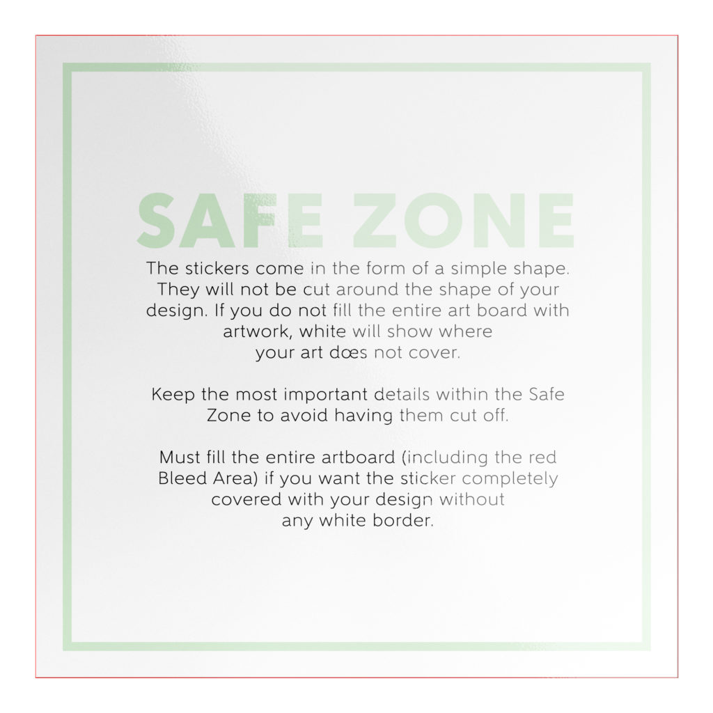
Template on Mockup
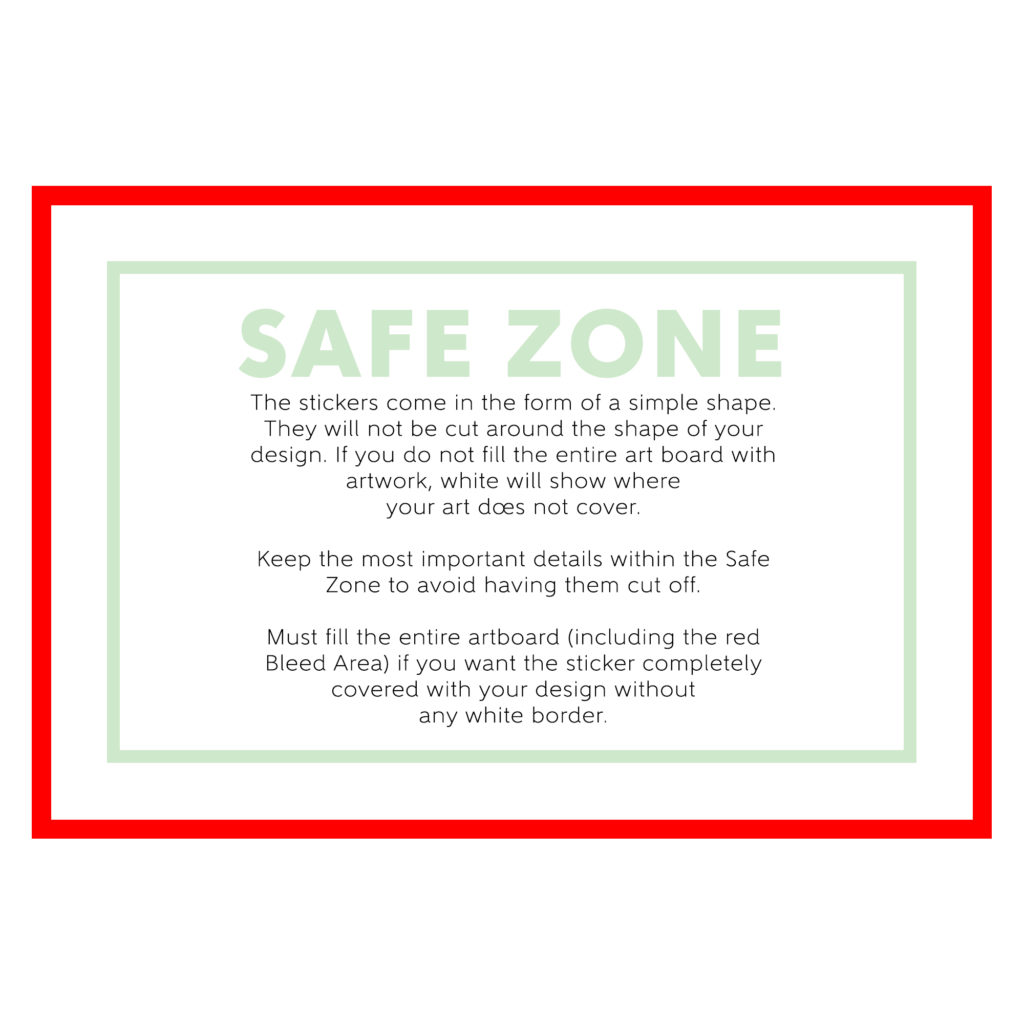
Horizontal Rectangle Sticker Template 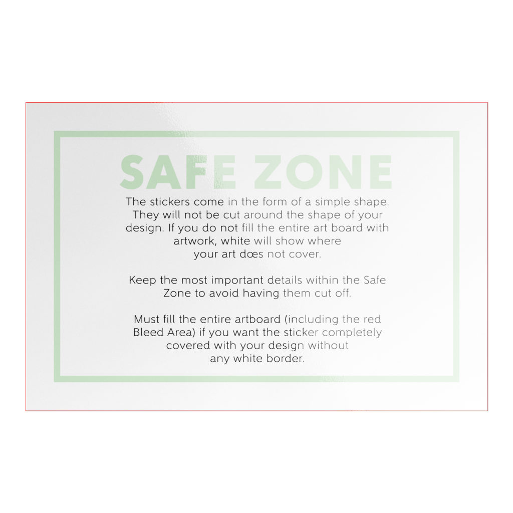
Template on Mockup
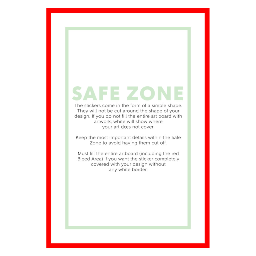
Vertical Rectangle Sticker Template 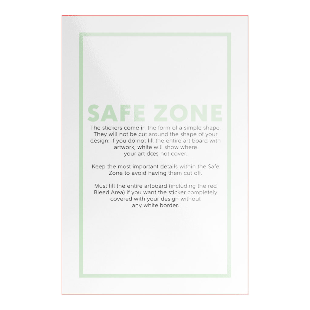
Template on Mockup
The Safe Zone is denoted by the green outline. Keep the most important aspects of your design within the safe zone to ensure they are printed on the final product. Anything outside of the safe zone has the potential to get cut off.
The Bleed Area is denoted by the red outline. The bleed will likely not show on the final print, but is there as insurance incase the production cut is slightly off. If you do not want a white border around your sticker, it is imperative that you make sure your design extends through the bleed area – be it a background image, color, or texture.
DESIGN TIPS
Designing for stickers is pretty straight forward. However, there are a few things to keep in mind to make sure your designs print to their full potential.
1.) The Simpler, The Better: Sticker designs tend to be more impactful to the viewer if they are simple, bold, and easy to digest visually. We offer multiple sizes of stickers, but have you build your artwork for the largest size and scale it down accordingly upon purchase. This is important to understand because if you create a highly detailed design, you may lose detail the smaller the sticker gets. If you keep your artwork simple and bold, you ensure your designs will print ideally across all sizes.
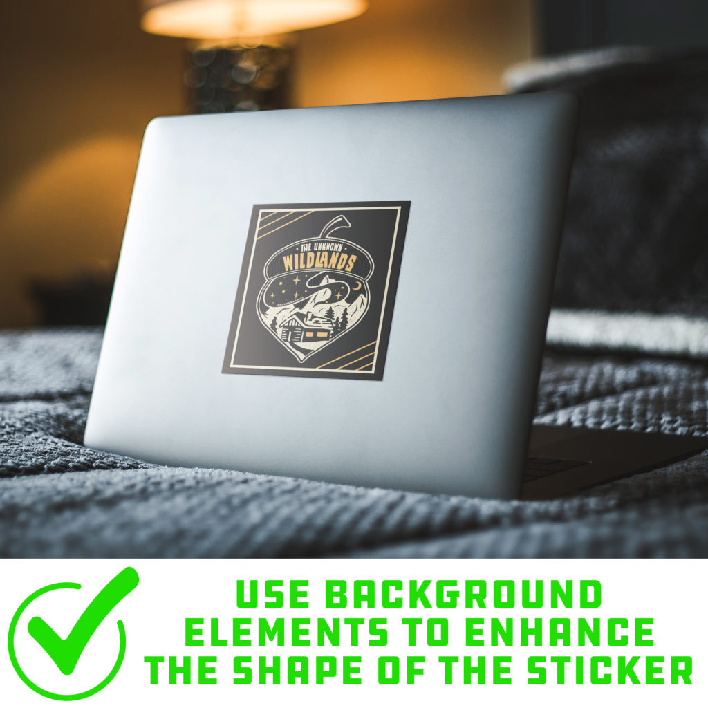
2.) Borders: As stated before, the stickers are available in simple shapes. They are also printed without a border (unless added within your design). Since the stickers are in the form of a simple shape, placement of artwork is extremely important because unused space will print white within the shape. If you prefer the look of a border on your stickers, you must add the border within your design. The base of the sticker is white, so if you do not want white to show, you must fill the print area with the color of your choosing.
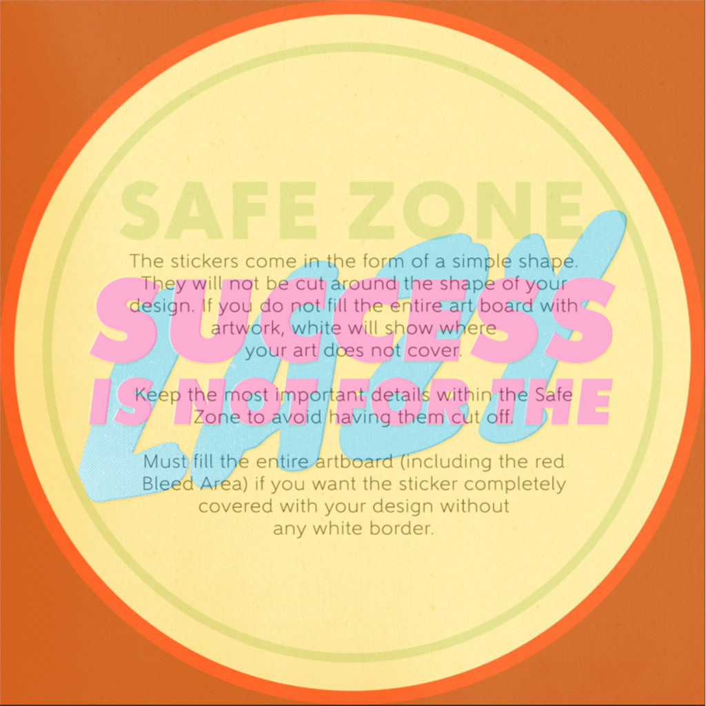
No Border – Entire Template is Covered with Artwork 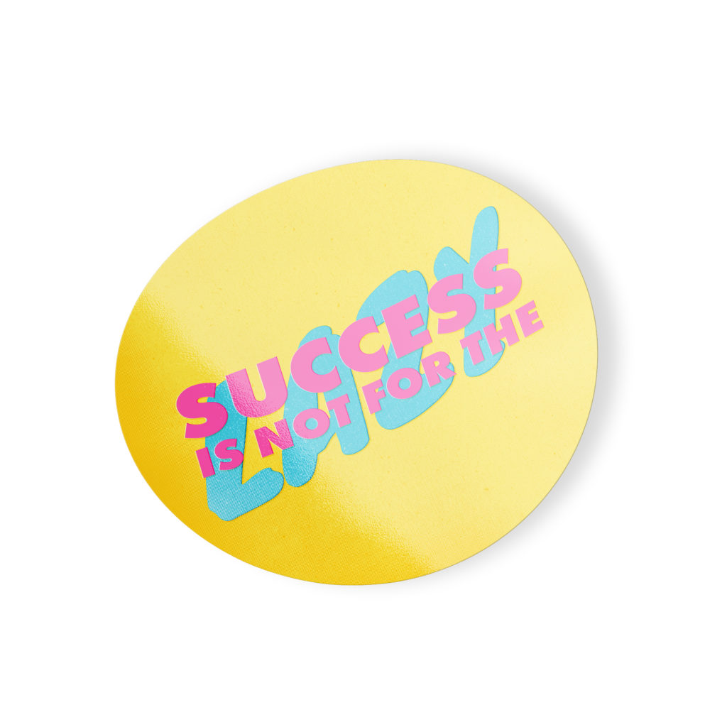
No Border – Mockup
Border – Border is Built into Design 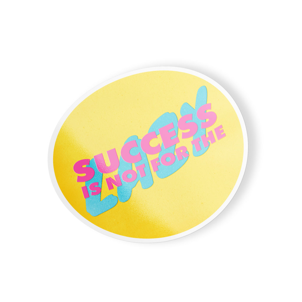
Border – Mockup
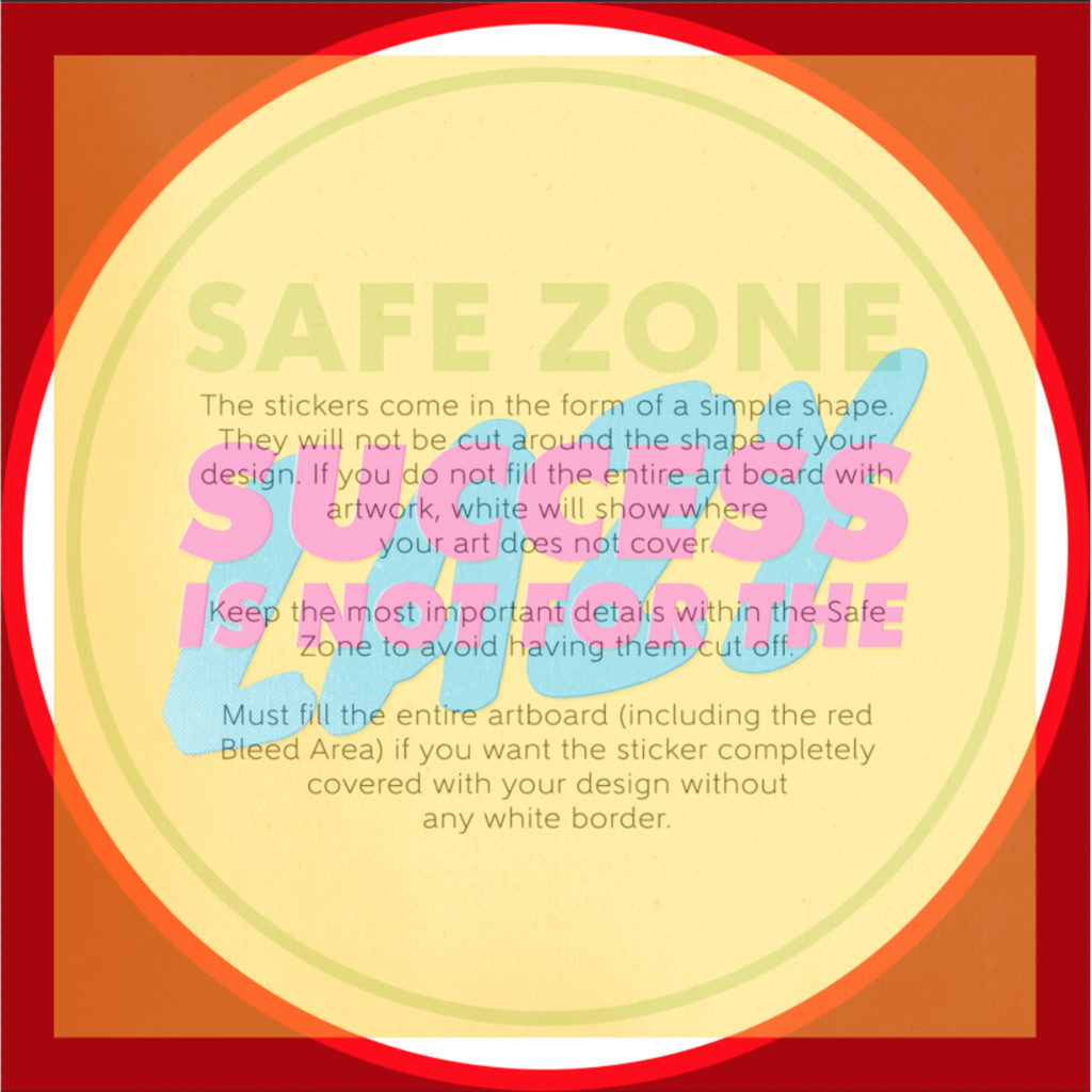
Unfilled – Artwork Does NOT Cover Template 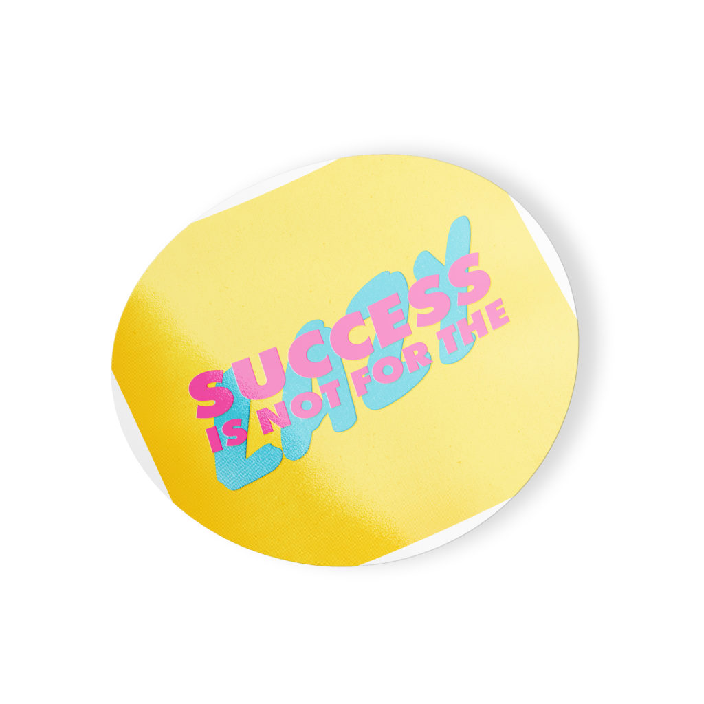
Unfilled – Mockup
3.) Font Size: We commonly get asked what is the smallest font size that is acceptable for print. This is a difficult question to answer as there are many typefaces with different weights, styles and size variations. A rule of thumb for choosing typefaces and typeface size is if it is difficult to read in the template at 100% view, it will be difficult to read on the final product. If you insist on using a smaller typeface, we recommend choosing a font that is legible as well as spacing your text out enough to easily distinguish what each letter is. More often than not, serif fonts tend to work the best in these situations due to the unique stems at the top/bottom of each letter that makes it easily identifiable.
4.) RGB vs CMYK: Knowing your color codes may be the most important practice when using Print on Demand. RGB (Red, Green & Blue) is the color code for web applications. CMYK (Cyan, Magenta, Yellow & Black) is the color code for print applications.
We ask that our users upload artwork in RGB because they are uploading a graphic to the web. We strongly recommend checking the files in CMYK prior to upload because the graphic uploaded in RGB will be converted to CMYK at the print facility. DO NOT upload artwork to the app in CMYK – this will cause issues with how your design colors are represented on the mockup images. Upload your artwork in RGB, but check your file in CMYK first and adjust accordingly.
Some colors are created specifically for your screen using RGB. We call these backlit colors as they are using light from your computer monitor to add more intense vibrancy that cannot be reproduced in the printing process. This is why we always recommend checking your files in CMYK before uploading because there can be drastic shifts in color that completely change what is shown on your mockup image versus the final product. Please see the example below.
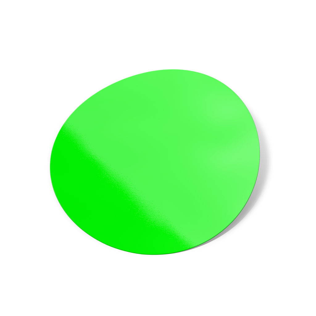
RGB – Backlit Color 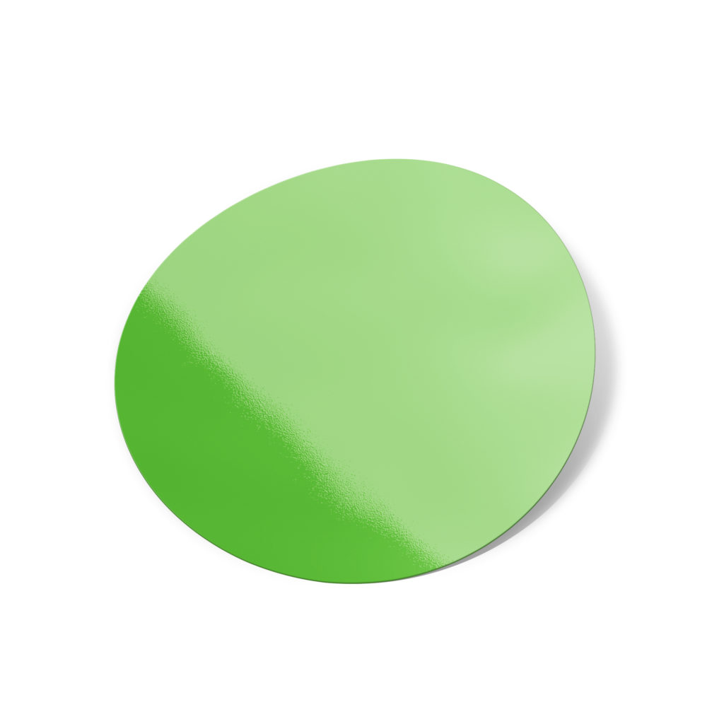
CMYK – How Green Will Reproduce in Print
