Lets talk about how to properly create mockup images of your canvas prints. A common error we see throughout the web (relating to canvas print mockups) is the size and scale of the prints in comparison to the objects in the scene. I cannot tell you how many times I’ve scrolled through my Facebook newsfeed and came across a beautiful canvas print ad displaying a huge work of art that covers an entire wall nearly the same size as the sofa below it.
After further inspection, you see that these canvases are only 20″ x 24″. This is misleading and most certainly upsetting for the customer who orders it. We want your customers to be happy with their purchase. That is why we strongly recommend considering scale when creating custom mockup scenes. We know you want to feature your print in a life-like setting, so we have come up with a few tips to help with this.
Not every canvas needs to be displayed in a large room setting

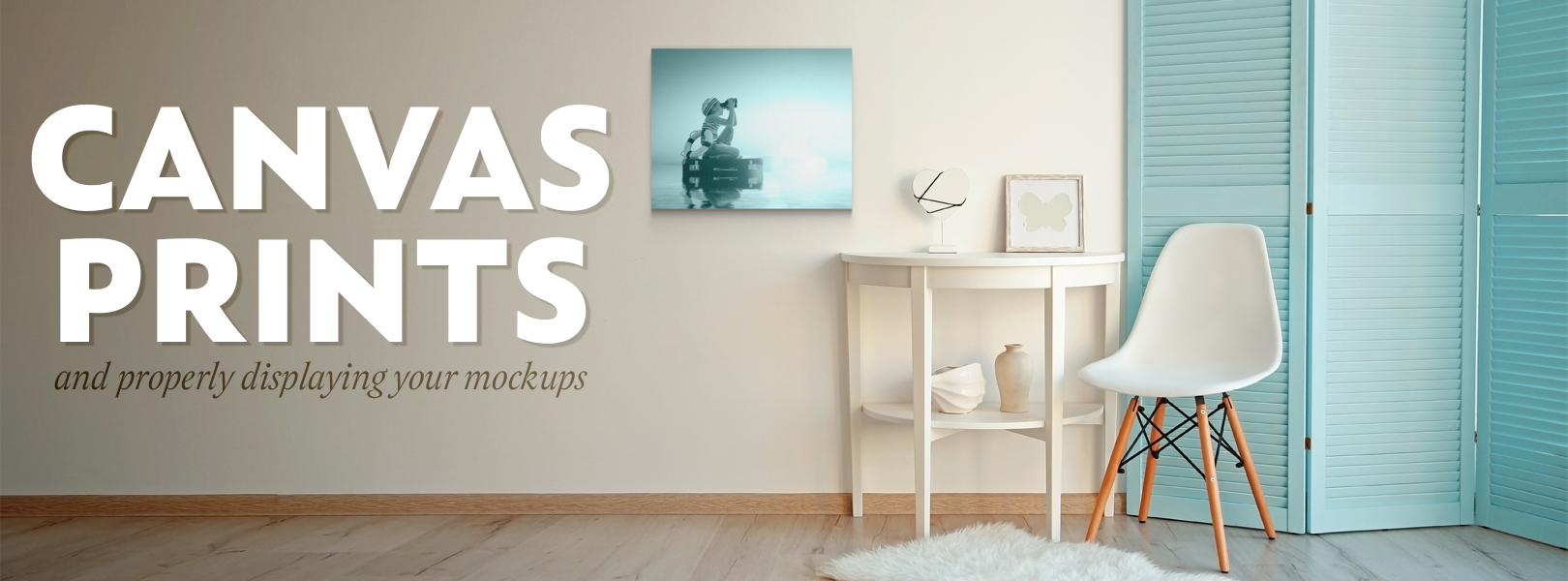
It is hard to make a smaller canvas look impactful in a large setting. In fact, it can look quite awkward. Rather than trying to make the canvas cover the entire wall space, re-think the space entirely. Find more practical situations to display the canvas that is still proportionate to the objects around it.
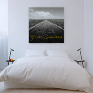
 In our example you see the common mistake of making the canvas much larger than it actually is in this bedroom. Sure, it looks great and who wouldn’t want a work of art that large for a fraction of the going rate of a print that size? This is not an accurate representation of what we are trying to sell though. Instead, a better option is creating a scene that still features the print, but at its correct scale, like the example with books on the table.
Using enough of the scene to create the look and feel you desire
 More often than not, a sofa and a wall are the easiest and most powerful ways to display a canvas print. Hey, we get it AND we support it! Rather than focusing on getting every little accessory in the shot; every side table, even the entire sofa/whatever it may be… focus on getting enough of those secondary aspects of the scene in the shot without taking away from the main focus, THE CANVAS.
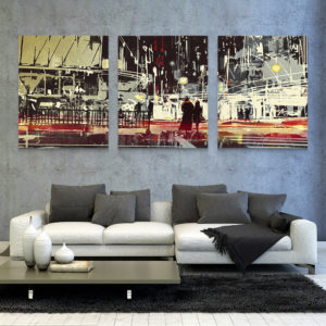
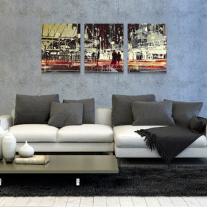
 As you can see in the example, the incorrect way to display the canvases, once again, is to make them as big as possible to fill the space. What we did in the other example was properly scale our designs to fit in comparison to the sofa, then scaled both together until we reached a point where our canvases were the feature while still providing a strong frame of reference to a living quarters.
Order samples and take REAL pictures
Often times we rely too much on digital mockups. Sometimes a real image of the actual product makes a stronger impact on the consumer. They know this is a real product and begin to feel more comfortable with the buying process after seeing something that is tangible. Some of our more successful users have tapped into this by ordering sample products to take pictures of the real deal.
For one, they get to see first-hand the quality of what they are selling, the quality of the designs they upload, and how the packaging and shipping works for their customers. Not only is it good practice to see what you’re sending out the door, you can use the sample as an advertising opportunity in the form of a giveaway!
We hope you find these tips and suggestions useful. We want to be as helpful as possible. Remember… we are in this together! Here’s to all of our continued success.
