THE IMPORTANCE OF THE PRINT TEMPLATE
Using the print templates provided within the app is important for all teelaunch products, but even more so for wall flags. The wall flag is a finished product that goes through the sublimation print process. This means that not every flag is exactly the same and some inconsistencies can occur. If you do not follow the template correctly, we cannot guarantee certain aspects of your design will show up on the final product.
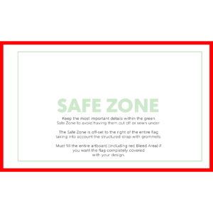
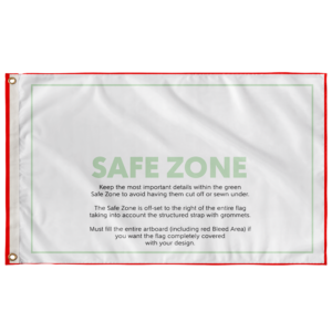
When using the template to create your artwork, pay close attention to the Safe Zone. The safe zone is denoted by the green box. The most important aspects of your design should remain within the safe zone to ensure they are printed on the final product. Anything outside of the safe zone runs the risk of getting trimmed off.
The safe zone is not centered on the flag. It is off-set from the grommet side of the flag. Since the entire flag gets printed on, we have shifted the safe zone to prevent users from accidentally placing important graphical elements on the structured band (with grommets). Essentially this will allow your main artwork to breathe by giving ample space from the edges of the flag.
SUBLIMATION PROCESS
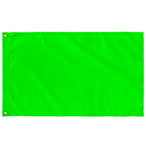
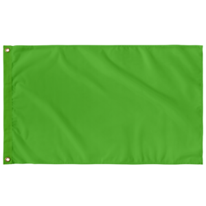
The wall flags are a product that get printed through the sublimation process. During the sublimation process, inks are heated to a gaseous state which enables the print to sink into the product pores. When the temperature drops, the ink returns to a solid state and becomes a part of the product. This process allows for longer lasting and more durable prints.
DESIGN TIPS
Knowing the print process helps with creating your designs. Typically sublimation reproduces prints quite accurate to the file you submit to our app. However, there are a few things to keep in mind to ensure your design prints to your satisfaction.
1.) Drop-Shadows: Drop-Shadows help add depth and dimension to designs, but they do not always play nice in the sublimation process. Often times drop-shadows tend to bleed into other aspects of the artwork making the final product look less than ideal in comparison to the uploaded design file. One way to combat this is by using halftones. Halftones are varying sizes of solid color dots that give the illusion of gradients while applying solid color rather than fading from dark to light opacity like you would find in a drop-shadow.
2.) Low Opacity Elements & Blending Modes: Using varying opacities and blending modes helps designs appear more dynamic and, in some cases, more realistic. The sublimation process can blend these effects further than your liking. We suggest erring on the side of higher opacity and blending items to be brighter than what you would prefer on your computer screen. For example, if you like the way your graphic looks at 15% opacity, we would suggest increasing the opacity to 25%-35% so it is not lost on the final print.
3.) RGB vs CMYK: Knowing your color codes may be the most important practice when using Print on Demand. RGB (Red, Green & Blue) is the color code for web applications. CMYK (Cyan, Magenta, Yellow & Black) is the color code for print applications.
We ask that our users upload artwork in RGB because they are uploading a graphic to the web. We strongly recommend checking the files in CMYK prior to upload because the graphic uploaded in RGB will be converted to CMYK at the print facility. DO NOT upload artwork to the app in CMYK – this will cause issues with how your design colors are represented on the mockup images. Upload your artwork in RGB, but check your file in CMYK first and adjust accordingly.
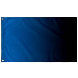
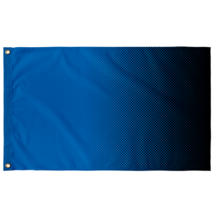
Some colors are created specifically for your screen using RGB. We call these backlit colors as they are using light from your computer monitor to add more intense vibrancy that cannot be reproduced in the printing process. This is why we always recommend checking your files in CMYK before uploading because there can be drastic shifts in color that completely change what is shown on your mockup image versus the final product. Please see the example below.