THE IMPORTANCE OF THE PRINT TEMPLATE
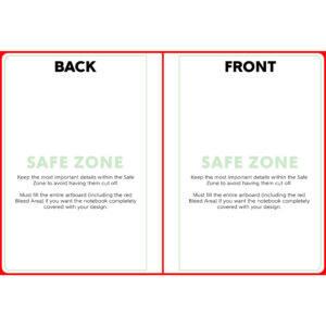
The print template for the notebook is set up to cover the front & back covers of the book as one piece. Understanding this will help to avoid unwanted overlap from cover to cover. If you do not follow the template correctly, we cannot guarantee certain aspects of your design will show up on the final product.
When using the template to create your artwork, pay close attention to the Safe Zone. The safe zone is denoted by the green box. The most important aspects of your design should remain within the safe zone to ensure they are printed on the final product. Anything outside of the safe zone runs the risk of getting trimmed off.
The red Bleed Area represents the edge of the product and then some. It is important to extend your artwork all the way through the bleed area. The bleed area will likely not show on the final product but if you do not have any artwork/color/texture you run the risk of having blank (white) portions that appear on the notebook. Bleed areas within print templates are in place as a preventative measure in case of errors that can occur in the printing/cutting process.
The red center line of the template is where the covers are cut to create the front and back pieces. Use this line as a guide to help identify where the back cover ends and front cover begins. If you do not have artwork in this area, you run the risk of having blank areas showing on the final product.
DESIGN TIPS
1.) Upload High Resolution Files: It is highly recommended that you upload art work at 300dpi. 300dpi is the standard resolution for print while 72dpi is reserved for web applications. Unlike other products, the journals have minimal textures to hide imperfections in your artwork. If you upload artwork lower than 300dpi it will likely show pixelation which can cheapen the overall quality of the product. You may not notice the low quality on the mockup images, so it is up to you to use your best judgement before uploading your design.
If all you have to work with is lower resolution images, a good tip is to apply textures or graphic overlays (filters) to hide glaring imperfections. Please see our blog post on image resolution HERE.
2.) RGB vs CMYK: Knowing your color codes may be the most important practice when using Print on Demand. RGB (Red, Green & Blue) is the color code for web applications. CMYK (Cyan, Magenta, Yellow & Black) is the color code for print applications.
We ask that our users upload artwork in RGB because they are uploading a graphic to the web. We strongly recommend checking the files in CMYK prior to upload because the graphic uploaded in RGB will be converted to CMYK at the print facility. DO NOT upload artwork to the app in CMYK – this will cause issues with how your design colors are represented on the mockup images. Upload your artwork in RGB, but check your file in CMYK first and adjust accordingly.
Some colors are created specifically for your screen using RGB. We call these backlit colors as they are using light from your computer monitor to add more intense vibrancy that cannot be reproduced in the printing process. This is why we always recommend checking your files in CMYK before uploading because there can be drastic shifts in color that completely change what is shown on your mockup image versus the final product. Please see the example below.