THE IMPORTANCE OF THE PRINT TEMPLATE
The dog bowls are printed through the sublimation process. Because of this, it is important to understand/use the print templates provided within the app to ensure the final product is created to your expectations. If you do not follow the template correctly, we cannot guarantee certain aspects of your design will show up on the final product.
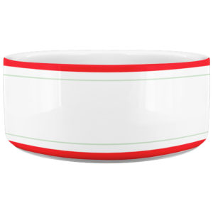
When using the template to create your artwork, pay close attention to the Safe Zone. The safe zone is denoted by the green box. The most important aspects of your design should remain within the safe zone to ensure they are printed on the final product. Anything outside of the safe zone runs the risk of getting trimmed off.
The red Bleed Area represents the edge of the product and then some. Since the bleed area is located at the upper and lower brim of the dog bowl, there is a likelihood that subtle fading may occur with the print located in this area. Because of this, we strongly recommend keeping the most important details of your design within the safe zone.
DESIGN TIPS
Designing for the dog bowls is pretty straight forward. However, there are a few things to keep in mind to make sure your designs print to their full potential.
1.) The Simpler, The Better: Dog Bowls are similar to mugs in the fact that the designs are smaller and have a greater impact if they are bold and easily digested by the viewer. Photorealistic designs are acceptable, but the heating process that adheres the artwork to the mug tends to blend fine details. We highly recommend creating simple designs that are easy to read and are void of fine details to ensure the best possible final print.
2.) Font Size: We commonly get asked what is the smallest font size that is acceptable for dog bowl designs. This is a difficult question to answer as there are many typefaces with different weights, styles and size variations. A rule of thumb for choosing typefaces and typeface size is if it is difficult to read in the template at 100% view, it will be difficult to read on the final product. If you insist on using a smaller typeface, we recommend choosing a font that is legible as well as spacing your text out enough to easily distinguish what each letter is. More often than not, serif fonts tend to work the best in these situations due to the unique stems at the top/bottom of each letter that makes it easily identifiable.
3.) Drop Shadows/Glows & Low Opacity Elements: It is highly recommended to avoid using drop shadows and glows when creating designs for ceramic products. This effect is generally a useful technique in adding dimension to your artwork but will not turn out ideally on a dog bowl. The gradient effect of a drop shadow/glow when printed on a ceramic gives the artwork a lower quality look and often times makes the graphic appear blurry.
Using design elements that have low opacity tend to get lost in the final print. If you have a design element that you want to be seen, it is recommended that you incorporate it into your design at 50% opacity or higher. The design is heated into the ceramic which can mean subtle details that you would normally see on your computer screen will be lost once applied.
4.) RGB vs CMYK: Knowing your color codes may be the most important practice when using Print on Demand. RGB (Red, Green & Blue) is the color code for web applications. CMYK (Cyan, Magenta, Yellow & Black) is the color code for print applications.
We ask that our users upload artwork in RGB because they are uploading a graphic to the web. We strongly recommend checking the files in CMYK prior to upload because the graphic uploaded in RGB will be converted to CMYK at the print facility. DO NOT upload artwork to the app in CMYK – this will cause issues with how your design colors are represented on the mockup images. Upload your artwork in RGB, but check your file in CMYK first and adjust accordingly.
Some colors are created specifically for your screen using RGB. We call these backlit colors as they are using light from your computer monitor to add more intense vibrancy that cannot be reproduced in the printing process. This is why we always recommend checking your files in CMYK before uploading because there can be drastic shifts in color that completely change what is shown on your mockup image versus the final product. Please see the example below.