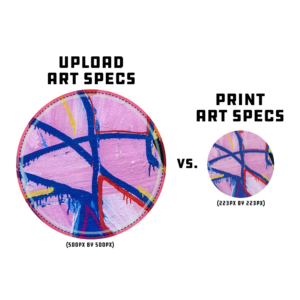
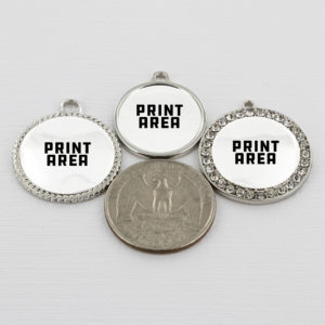
THE IMPORTANCE OF THE PRINT TEMPLATE
The print template for the bracelet charms is set up larger than the actual (REAL) print area. This was done to make your artwork acceptable across multiple charms so you only have to create one file. Also, this will help give your design a crisper look on the mockup images as we know the design is the real hero of the product. It is important to follow the template supplied in the teelaunch app because any portion of your design that falls out of the green Safe Zone may lose detail the closer to the edge of the charm it gets. The charm print area is also white. If you do not fill your design all the way through the red Bleed Area, there may be blank (white) areas on the final product. We cannot guarantee the accuracy of the print if the template is not followed correctly.
THE PRINT PROCESS
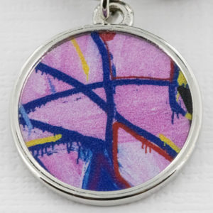
The bracelet charm is printed using the UV printing process which is different than the usual sublimation process. Ink is applied to the charm and UV light instantly drys the ink. Because the UV lights cure any printed ink immediately, the dots of wet ink have no chance to spread once printed, resulting in much finer detail. Typically sublimation prints sink into the product, but UV printing allows for the print to sit on top of the product – this can cause some subtle texture to occur. Your UV printed charm will likely have some slight texture to it, but this actually adds to the appeal of this particular printing process. The subtle texture has an added dimension which brings your artwork to life.
DESIGN TIPS
Designing for the bracelet charms is pretty straight forward. However, there are a few things to keep in mind to make sure your designs print to their full potential.
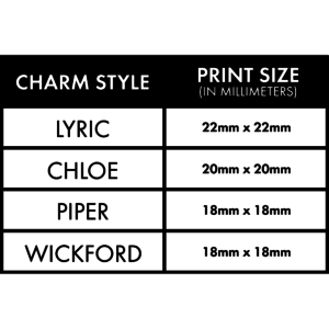
1.) Knowing The Size of The Charms: As stated above, the print template and specs provided for the bracelet charms is larger than the actual print area and charm itself. It is important to have a good understanding of this because when your artwork gets scaled down for print, the details of your graphic also get smaller which, in-turn, can make your final print hard to read. If you are ever in doubt about how your final print will turn out, please refer to the specifications below. If you create a document to the specs provided, you can drop your artwork created with our template in said document and scale down appropriately. If your graphic becomes unreadable after scaling down to the actual print size, it is a good indication that the final print will also not turn out very well.
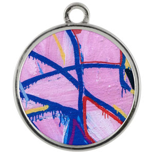
2.) The Simpler, The Better: Due to the actual size of bracelet charms, simpler designs tend to work best. The exception to this is abstract artwork or patterns. If you are wanting to use a design that is heavy in detail and design elements, we strongly recommend simplifying the design to only include the essential aspects of your artwork. Bold graphics/shapes with minimal text tend to be more impactful because they can be easily digested by the viewer. If your artwork is full of hard to read information, the print becomes far less impactful which is to the detriment of your customers & sales. We try to make the mockup images as realistic as possible, but there is no way to completely match what the final print will look like. Often times the detail on the mockup image will look sharper and more crisp than the final print. Keep this in mind if you are basing your designs solely off the mockup images.
3.) Font Size: We commonly get asked what is the smallest font size that is acceptable for charm designs. This is a difficult question to answer as there are many typefaces with different weights, styles and size variations. A rule of thumb for choosing typefaces and typeface size is if it is difficult to read in the chart above (Sect. 1 of Design Tips) at 100% view, it will be difficult to read on the final product. If you insist on using a smaller typeface, we recommend choosing a font that is legible as well as spacing your text out enough to easily distinguish what each letter is. More often than not, serif fonts tend to work the best in these situations due to the unique stems at the top/bottom of each letter that makes it easily identifiable.
4.) Drop Shadows/Glows & Low Opacity Elements: It is highly recommended to avoid using drop shadows and glows when creating designs for charms. This effect is generally a useful technique in adding dimension to your artwork but will not turn out ideally on a bracelet charm. The gradient effect of a drop shadow/glow when printed on a charm gives the artwork a lower quality look and often times makes the graphic appear blurry. If your design calls for one of these effects and you are unwilling to compromise, we suggest using a solid shadow/glow with sharp edges that do not softly fade out. This will add depth and help your artwork stand out while remaining clear to the viewer.

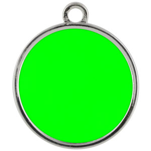
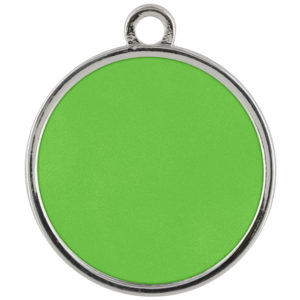
5.) RGB vs CMYK: Knowing your color codes may be the most important practice when using Print on Demand. RGB (Red, Green & Blue) is the color code for web applications. CMYK (Cyan, Magenta, Yellow & Black) is the color code for print applications.
We ask that our users upload artwork in RGB because they are uploading a graphic to the web. We strongly recommend checking the files in CMYK prior to upload because the graphic uploaded in RGB will be converted to CMYK at the print facility. DO NOT upload artwork to the app in CMYK – this will cause issues with how your design colors are represented on the mockup images. Upload your artwork in RGB, but check your file in CMYK first and adjust accordingly.
Some colors are created specifically for your screen using RGB. We call these backlit colors as they are using light from your computer monitor to add more intense vibrancy that cannot be reproduced in the printing process. This is why we always recommend checking your files in CMYK before uploading because there can be drastic shifts in color that completely change what is shown on your mockup image versus the final product. Please see the example below.