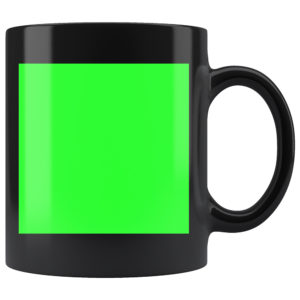
THE IMPORTANCE OF THE PRINT TEMPLATE
The template for the mug is set up to display the entire print area. When artwork is uploaded into the app; it is not scalable – this is why it is important to use the print template to help determine the size and placement of your artwork.
BLACK MUG SUBLIMATION PROCESS
The black mugs have a unique sublimation process. The initial blank black mug is only black on the handle, top, bottom, and inside of the mug. The actual print area is white. During the sublimation process, the white print area is filled with your artwork along with black ink to fill in the rest of the sublimation space. If there are white aspects within your design, it will be printed as the absence of ink – meaning the white base will take place of the white in your design. This is important to understand as ink bleeding can occur in the unfilled (white) areas.

DESIGN TIPS
Designing for black mugs is NOT the same as designing for white mugs. The sublimation process is more advanced, thus demands a real understanding of how to properly design for them as well as having a realistic expectation of the final product you are selling.
1.) The Simpler, The Better: Black mugs, more than white mugs, need to be simplified in order to achieve ideal results due to the sublimation process they use. Since the white sublimated area on the mug gets backfilled with black ink, highly detailed designs with intricate elements can incur overlap/bleeding from the black ink. Simple/Bold designs tend to work better as it leaves less room for any sort of ink bleed to happen.


2.) Off-White Color Palette: The print area of black mugs is white. This means that if there is white in your design, it is actually the absence of ink – meaning the base layer of the mug will show through where there is white in your design. This can be problematic for more detailed designs featuring the color white. It is recommended to make all of your white elements an off-white color so ink is actually applied. Converting your white design elements to off-white will also help in the prevention of black ink bleeding into those spaces where it would likely happen if left a true white color.
3.) Avoid Sharp Edges: Designs with sharp edges tend to look warped when placed on a cylindrical product such as a mug. Examples of sharp edges may be square or rectangular borders, solid background colors, photographs, etc. This is also true for designs that feature a circular element as it will appear more oblong once printed to the mug.
Another reason to avoid designs with sharp edges is human error. There is always an element of human error involved in the Print On Demand process and mugs are no different. When placing the sublimated printing paper on the mug before the heating process takes place, someone has to line the printing paper around the mug. Sometimes the end result of this is a graphic that is not 100% level. This is typically not a huge issue as it usually is a difficult thing to spot UNLESS there are sharp edge lines in the design. Sharp edges in a graphic tend to stick out like a sore thumb if there was any sort of mistake made during the alignment process of the sublimation paper.
4.) Font Size: We commonly get asked what is the smallest font size that is acceptable for mug designs. This is a difficult question to answer as there are many typefaces with different weights, styles and size variations. A rule of thumb for choosing typefaces and typeface size is if it is difficult to read in the template at 100% view, it will be difficult to read on the final product. If you insist on using a smaller typeface, we recommend choosing a font that is legible as well as spacing your text out enough to easily distinguish what each letter is. More often than not, serif fonts tend to work the best in these situations due to the unique stems at the top/bottom of each letter that makes it easily identifiable.
5.) Drop Shadows/Glows & Low Opacity Elements: It is highly recommended to avoid using drop shadows and glows when creating designs for mugs. This effect is generally a useful technique in adding dimension to your artwork but will not turn out ideally on a mug. The gradient effect of a drop shadow/glow when printed on a mug gives the artwork a lower quality look and often times makes the graphic appear blurry.
Using design elements that have low opacity tend to get lost in the final print. If you have a design element that you want to be seen, it is recommended that you incorporate it into your design at 50% opacity or higher. The design is heated into the ceramic mug which can mean subtle details that you would normally see on your computer screen will be lost once applied to the mug.
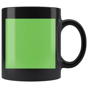
6.) RGB vs CMYK: Knowing your color codes may be the most important practice when using Print on Demand. RGB (Red, Green & Blue) is the color code for web applications. CMYK (Cyan, Magenta, Yellow & Black) is the color code for print applications.
We ask that our users upload artwork in RGB because they are uploading a graphic to the web. We strongly recommend checking the files in CMYK prior to upload because the graphic uploaded in RGB will be converted to CMYK at the print facility. DO NOT upload artwork to the app in CMYK – this will cause issues with how your design colors are represented on the mockup images. Upload your artwork in RGB, but check your file in CMYK first and adjust accordingly.
Some colors are created specifically for your screen using RGB. We call these backlit colors as they are using light from your computer monitor to add more intense vibrancy that cannot be reproduced in the printing process. This is why we always recommend checking your files in CMYK before uploading because there can be drastic shifts in color that completely change what is shown on your mockup image versus the final product. Please see the example below.