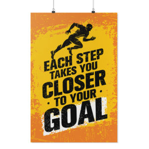
Designing for posters is about as straight forward as it gets for print on demand products. However, there are a few things to keep in mind to make sure the final print is up to standards.
THE IMPORTANCE OF THE PRINT TEMPLATE
Our posters are unique because they are printed on high quality matte paper (to reduce glare and fingerprints) and they are borderless poster prints. Knowing how to properly create artwork based off the print templates provided in the app is essential to achieving a poster with no border.
Each poster template (11×17, 18×24, 24×36) has a red “Bleed Area” located at the very edges of the design area. It is important to make sure your artwork goes through this area. If you choose to leave this area blank, a slight white border will surround your poster design. This can make your final print look unfinished or as if there was a mistake made during the print process. If you prefer the look of a border, we suggest adding the border to your actual design.
The green Safe Zone is in place as more of a suggestion than actual “safe zone” for poster prints. What we mean by this is your artwork will print as long as it is within the bleed area of the template, but we recommend giving important elements within your design some room to breathe. The safe zone, in this instance, is more of a guide to help enhance the look of your design. *This is a unique instance for posters only – please keep important details of your designs within the safe zone for all other teelaunch products.
DESIGN TIPS
1.) Upload High Resolution Files: It is highly recommended that you upload art work at 300dpi. 300dpi is the standard resolution for print while 72dpi is reserved for web applications. Unlike other products, posters have minimal textures to hide imperfections in your artwork. If you upload artwork lower than 300dpi it will likely show pixelation which can cheapen the overall quality of your poster. You may not notice the low quality on the mockup images, so it is up to you to use your best judgement before uploading your design.
If all you have to work with is lower resolution images, a good tip is to apply textures or graphic overlays (filters) to hide glaring imperfections. Please see our blog post on image resolution HERE.
2.) Give Your Artwork Room to Breathe: Just because you can cover the entire poster with artwork, does not mean it will always look good. A common mistake made by most beginner designers is when they try to cover as much space with their design as possible. This isn’t always a bad thing, but in most cases, it can be the difference between a graphic looking like it was created by an amateur vs a professional. Give the important aspects of your design plenty of room from the edges of the poster. This allows your artwork to shine and stand out rather than feel cramped within the confines of the print area. Don’t be afraid of negative (empty) space. Negative space can be utilized to make your graphic appear more clean and polished.
3.) RGB vs CMYK: Knowing your color codes may be the most important practice when using print on demand. RGB (Red, Green & Blue) is the color code for web applications. CMYK (Cyan, Magenta, Yellow & Black) is the color code for print applications.
We ask that our users upload artwork in RGB because they are uploading a graphic to the web. We strongly recommend checking the files in CMYK prior to upload because the graphic uploaded in RGB will be converted to CMYK at the print facility. DO NOT upload artwork to the app in CMYK – this will cause issues with how your design colors are represented on the mockup images. Upload your artwork in RGB, but check your file in CMYK first and adjust accordingly.
Some colors are created specifically for your screen using RGB. We call these backlit colors as they are using light from your computer monitor to add more intense vibrancy that cannot be reproduced in the printing process. This is why we always recommend checking your files in CMYK before uploading because there can be drastic shifts in color that completely change what is shown on your mockup image versus the final product. Please see the example below.
