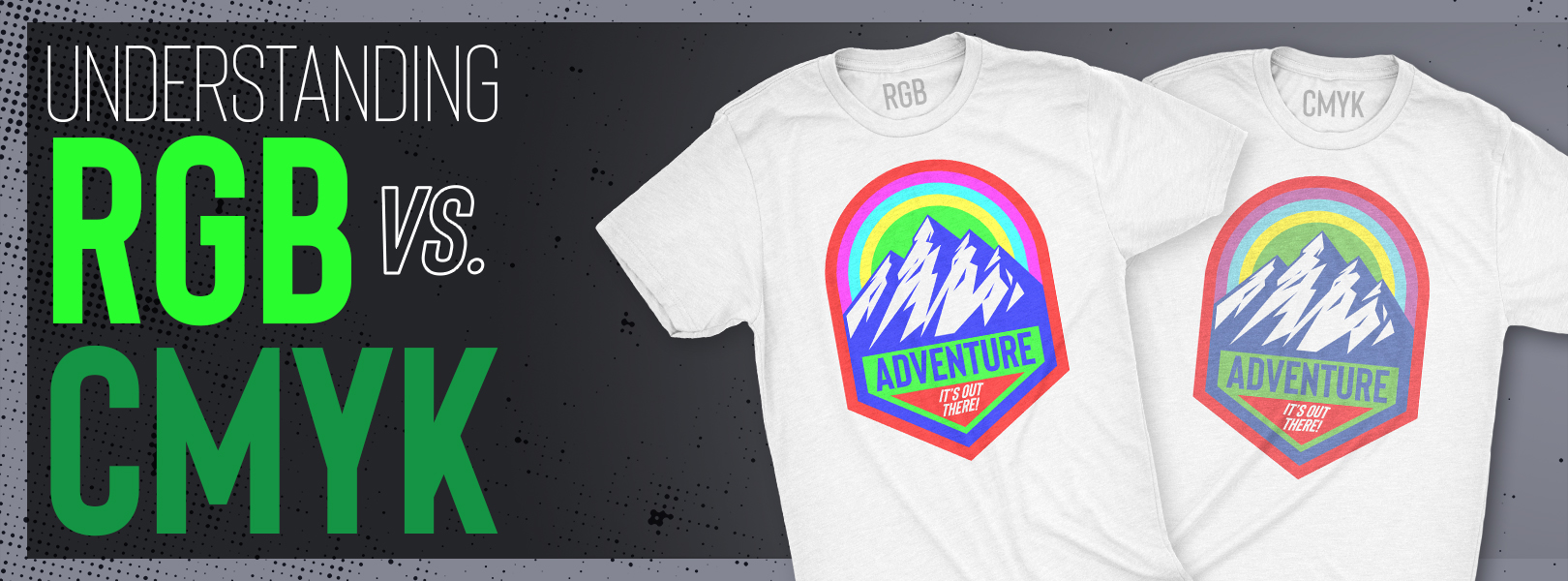
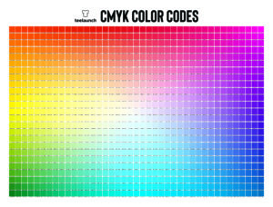
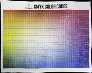
Understanding color codes is vital when it comes to designing and uploading your artwork into the teelaunch system. In this blog we will discuss the differences between RGB & CMYK as well as how these color codes appear on the web versus the final print your customer receives. At the end of the blog we will supply you with a CMYK color sheet that will become a useful tool for you when creating your artwork.
WHAT THE ABBREVIATIONS MEAN:
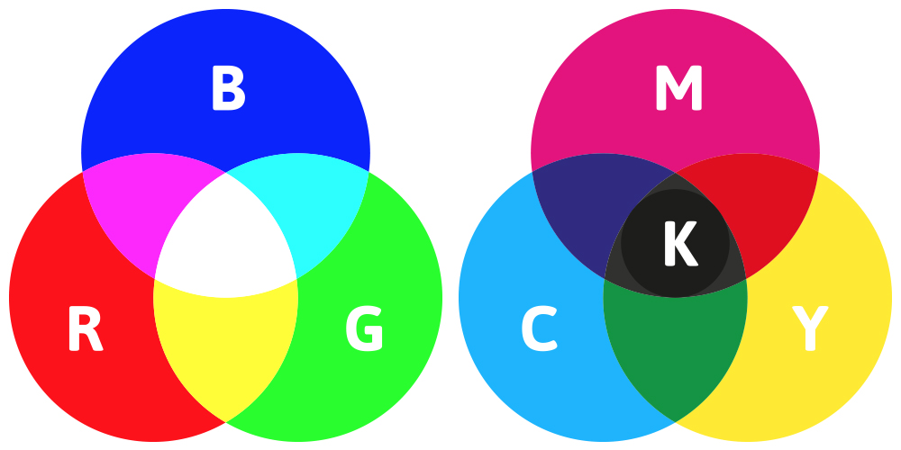
RGB – Red/Green/Blue
CMYK – Cyan/Magenta/Yellow/Key (Black)
WHAT THE COLOR CODES ARE USED FOR:
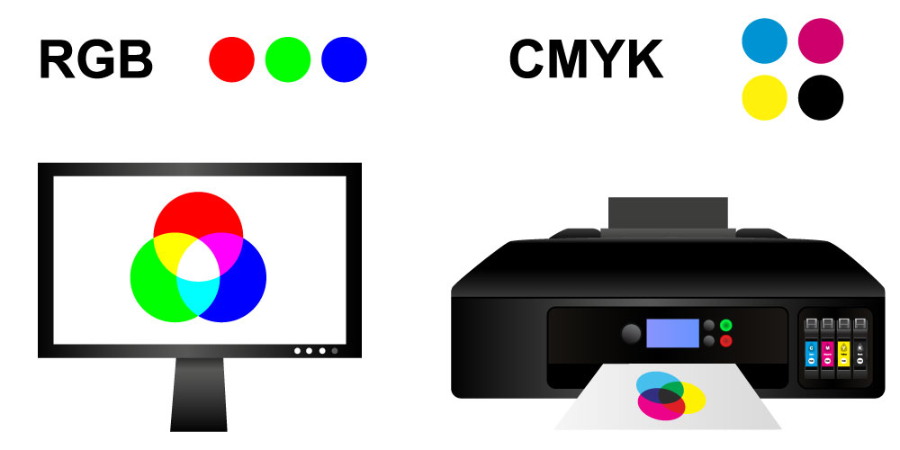
RGB is the color code most commonly used for web applications. The RGB color model is an additive color model in which the red, green, and blue primary colors of light are added together in various ways to reproduce a broad array of colors. Since RGB is used for web based imagery, it has the ability to create a vibrant color spectrum that isn’t always obtainable by traditional print methods.
CMYK is used for the printing process through what is known as a subtractive color model. Because of this subtractive color model, the ability to achieve specific colors is not possible without an additive. This is why CMYK colors can appear less vibrant and even dull in comparison to RGB.
WHY IS THIS IMPORTANT TO KNOW?:
It is important to understand the difference between RGB & CMYK because you will be using both when you use the teelaunch system.
RGB – Since we will be creating mockup images of your design/product for the web, we ask that you upload in RGB to avoid complications with how your artwork will appear on screen. Even if you uploaded artwork in CMYK, it will automatically be converted to RGB regardless. This does not mean you should upload your artwork into our system in CMYK, however. If you upload your artwork in CMYK, you run the risk of strange abnormalities that can occur that could invert your colors upon making the color shift.
CMYK – Your artwork will be printed in CMYK. This is why we strongly suggest that you are checking your files in CMYK prior to saving and uploading into our system. This will help you get a better sense of the color shifts that may occur and adjust accordingly.
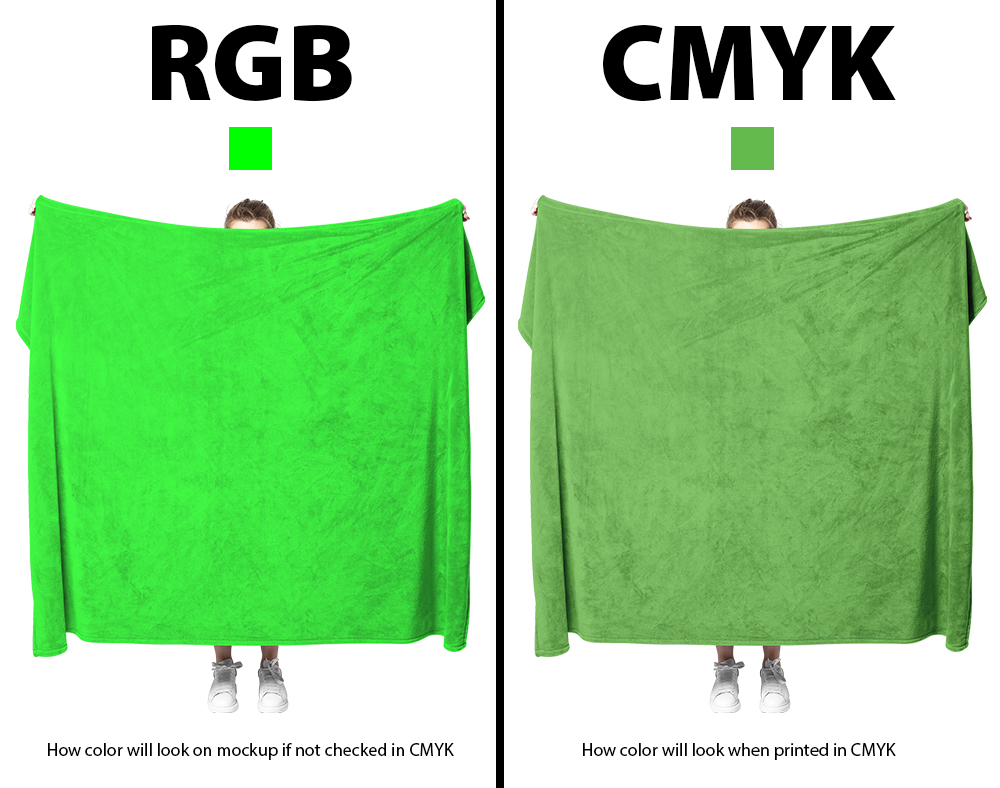
You will tend to see the most drastic shifts in color in what we like to call “backlit colors”. Backlit colors are those trendy neon/highlighter colors that are only achievable with RGB. The CMYK printing process simply will not allow us to mimic these colors, so it is up to you to make the proper adjustments to ensure your customers are going to get a product that closely resembles what they see on their computer screen.
You may be saying to yourself “Popular brands like Nike seem to be able to offer these colors in their products, why can’t you?”. In simplest terms, they are using a different print method with specialty inks that allow them to do so. As it currently stands, we offer DTG printing on our garments and Sublimation printing for most other products. DTG printing is essentially printing with large inkjet printers made specifically for garment materials. Sublimation printing is a process in which your artwork is printed on transfer paper and once that paper is applied to the physical product, it is pressed and heated so the ink turns into a gaseous state which allows your artwork to set into the material/fibers/pores – thus making the print more durable and one with the product.
USEFUL MATERIALS:
In order to offer our users as much information as possible, we have put together a CMYK color sheet complete with hex codes. We also took that same sheet and had it printed on a large blanket so you can see a real world example of how those CMYK colors translate to print. We recommend downloading the full resolution versions of these materials and accessing them whenever you need assistance with your color palate.
Although we used a design specifically made with CMYK colors, we did upload the artwork in RGB to ensure the most accurate representation that our users would experience.
To recap, check the files you create in CMYK prior to saving/uploading in RGB. Make the necessary adjustments to ensure your color palate is to your liking. It is always best that your mockup image is an accurate representation of what your customer will receive.
