From Riley, Teelaunch’s Creative Design Guru
Hey hey—Riley here.
St. Patrick’s Day is one of those holidays where you can win big with simple designs… or completely disappear in a sea of clovers and “Kiss Me I’m Irish”
Let’s do this the smart way.
Below are my best design tips to help you make St. Patty’s Day products that feel fresh, print clean, and stand out in listings.
1. Pick a lane: Cute, Clean, or Chaotic
St. Patrick’s Day designs usually fall into 3 buckets:
- Cute: friendly characters, simple icons, soft shapes, playful phrases
- Clean: minimal type, modern badges, classy Irish nods (no cartoon overload)
- Chaotic: loud humor, bold type, party energy, “bar crawl” vibes
The mistake is trying to do all three at once. Choose one vibe and commit.
Quick shortcut:
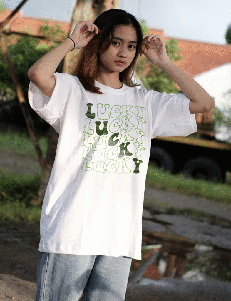
If it’s going on a shirt → Cute or Chaotic tends to perform.
If it’s on home goods (mugs, blankets, décor) → Clean often wins.

2. Use “St. Patrick’s Day” without saying it
You don’t have to literally write “St. Patrick’s Day” for people to get it.
Instead, lean on visual language like:
- clovers / shamrocks (but use them intentionally—more on that in a sec)
- rainbows
- gold coins / pots of gold
- leprechaun hats (tastefully… please)
- Celtic-inspired patterns (subtle = classy)
- beer/wine themes for adult designs
Pro tip: A design can feel like the holiday even with just:
- green + gold palette
- a single clover icon
- a short phrase with Irish energy
That’s how you avoid looking like everyone else.

3. Typography is the real hero (seriously)
St. Patrick’s Day is a text-driven holiday. Your font choice matters more than your clipart.
Try these combos:
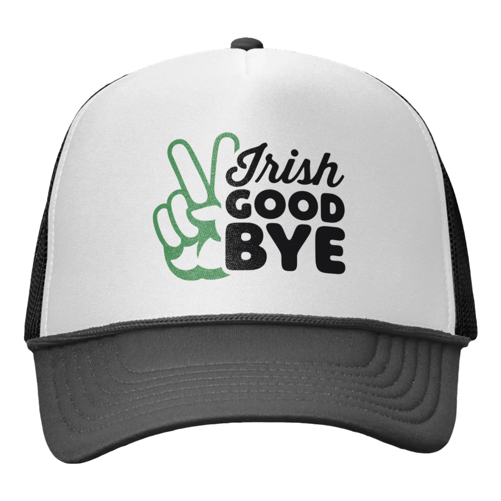
- Bold sans + script accent (party/cute)
- Slab serif + simple icon (retro pub vibes)
- Condensed bold + arched badge (sporty + clean)
- Hand-drawn marker + doodles (kid-friendly)
Avoid: overly thin scripts, overly decorative “Irish” novelty fonts that become hard to read.
Test: Zoom out to 10% size. If it’s not readable, it’s not ready.

The “5 amazing assets a week” approach
You don’t need 50 okay designs. You need a handful of winners.
Here’s a weekly mini-plan:
- 2 text-first designs (font + phrase = quick win)
- 1 badge/logo style (clean and premium)
- 1 niche design (teacher, nurse, dog mom, etc.)
- 1 “hero” concept (your best, most polished piece)
Then test. Double down on what gets clicks.
Quick checklist before you publish
Before you list, run your design through this:
✅ Readable as a thumbnail
✅ Thick enough lines to print clean
✅ 2–4 colors max (usually)
✅ Works on both light and dark backgrounds
✅ Doesn’t rely on tiny details
✅ Looks intentional, not cluttered
If you can check those boxes, you’re already ahead of most holiday designs online.
Final Riley advice: Keep it simple, keep it sharp
St. Patrick’s Day is fast and crowded. Your goal isn’t to be the loudest—it’s to be the clearest and most clickable.
