Defining a Bleed
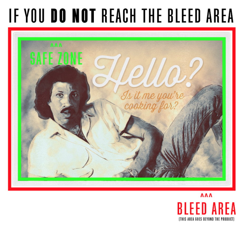
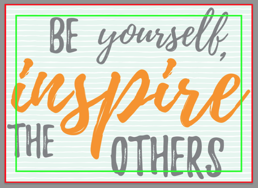
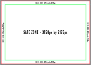 Bleeds allow you to have your artwork run to the edge of the printed on item. This allows for any errors in the cutting/placement process. This means whatever is in the “Bleed Zone” has the potential of being left out of the final product, but likely will only be a small portion. This is why the most important part of your design should be within a “Safe Zone”.
Also, if there is a Bleed area available, you should fill that area with something. If you do not, the area left out will be filled in white. Unless you want a white border around your artwork, you should plan to fill your artboard to the Bleed area.
Defining a Safe Zone
A Safe Zone is what it sounds like. A zone where the artwork will be safe from being altered during the cutting/placement process. While a bleed goes to the very edge of a design, the Safe Zone will be within the confines of the overall design.
Placement of a design
When placing a design with a Bleed and Safe Zone, there are a few factors to consider.
1. What is the most important part of my design?
- This should be defined before you start creating any design. Is it a pattern/saying/graphic?
- If you are designing a pattern, odds are, you can place the design to the bleed mark without any issues. Even if a little gets cut off, it is a repetitive design that is already being printed.
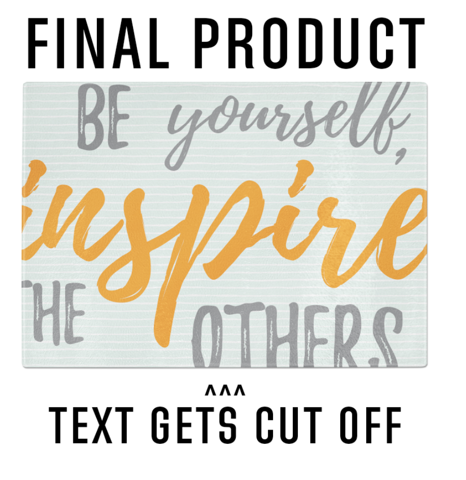
- If your most important part of your design is text, you will need to be certain to keep the text within the Safe Zone. Nobody wants to have their text cut in half and become hard to read.
- If the most important part of your design is a graphic, you must decide if the entire graphic needs to be visible or if some of the graphic can fall into the Bleed area.
2. Can my design fall into the Bleed area (outside of the Safe Zone) and still work for what I am trying to achieve?
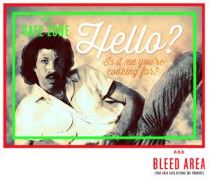 If you’ve decided or are forced to create a design with a graphic that falls into the Bleed area, try to keep the main details within the Safe Zone. For example, if your design is a portrait, it is likely the most important part of the design is from the shoulders up. Imagine a portrait painting. You do not see the waist down of the painting after the frame ends. You only see the important features of the painting. You may be forced to place a little more of the design into the Bleed area, but do not worry so much about what has the potential of being cut off – rather that the main part of the design is safe from being left out of the final print.
Sometimes a design works better if the graphic reaches the Bleed area. This is typically the case if you are trying to achieve a cropped look. When trying to achieve this look, placement becomes more crucial in the overall feel of the design. To make your design more interesting, find the most dynamic part of the design and feature that within the Safe Zone. A good rule for cropping is “The Rule of Thirds”.
Learn more about the rule of “The Rule of Thirds” here.
3. Does my artwork have enough room to breathe and look as professional as possible?
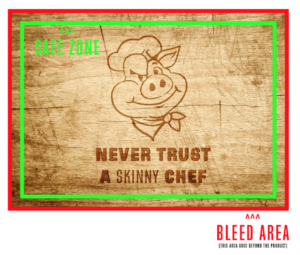 When talking about letting your design “breathe”, we mean just because there is a Safe Zone, does not mean the design should be placed to the absolute edge of that zone. When creating designs, I generally like to leave an 1/8 inch or more space between my design and Safe Zone. This will allow for the design to feel far less cramped.
If your artwork “just doesn’t feel right”, try adding some negative space around your design to help open up the overall look. This is a trick most especially reserved for text, but also comes in handy for graphics as well. Nothing screams amateur work more than stretching the limits of a design to the maximum due to the fear of not driving the point home. Less is more rings true in these situations.
Common Issues
